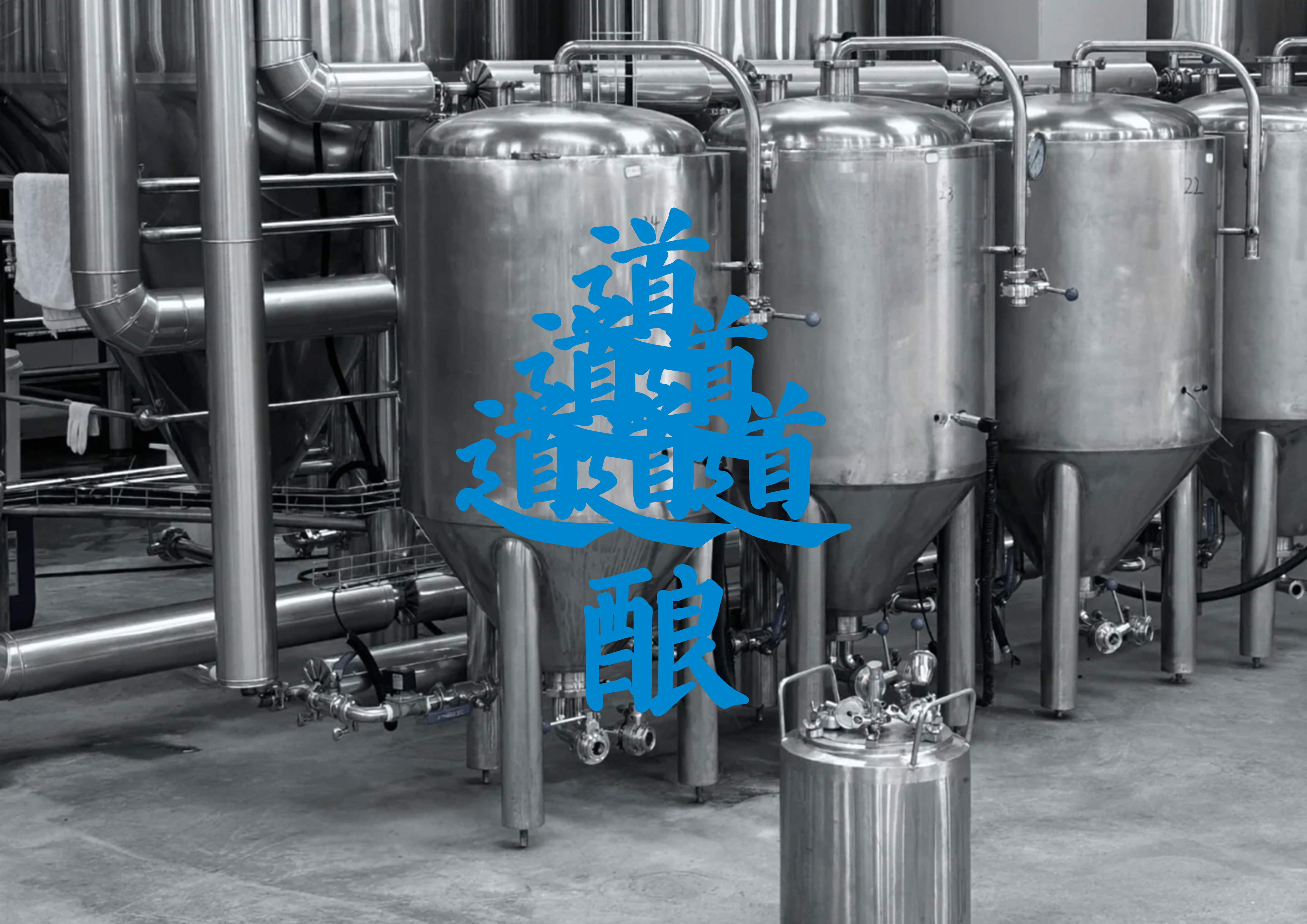
DAO BREW is the pioneer of craft beer in China, established in Chengdu in 2009. In our new visual identity (VI) at DAO BREW, we adhere to the brand philosophy of " Cultured Brewing, Savage Takeoff," aiming to communicate and envision through words. The combination of "Dao" signifies diversity, uncertainty, disorder, chaos, and the innate innocence of nature. It emphasizes creating an 'artistic concept,' recognizing that the path that can be described is not the eternal path. 'Niang' stands for brewing, ensuring the effective conveyance of product information. The typography and layout reflects the brand's personality and quality.
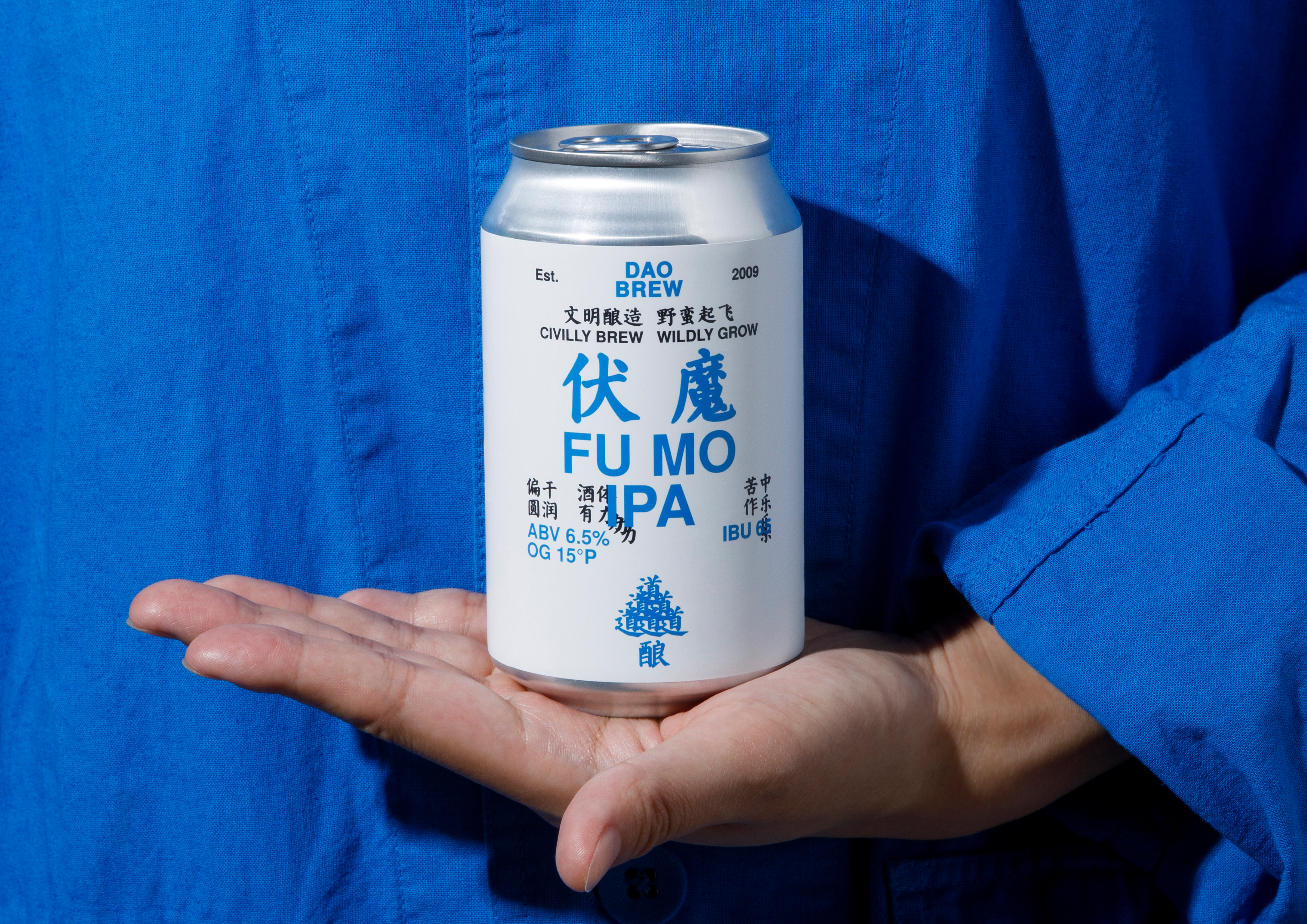
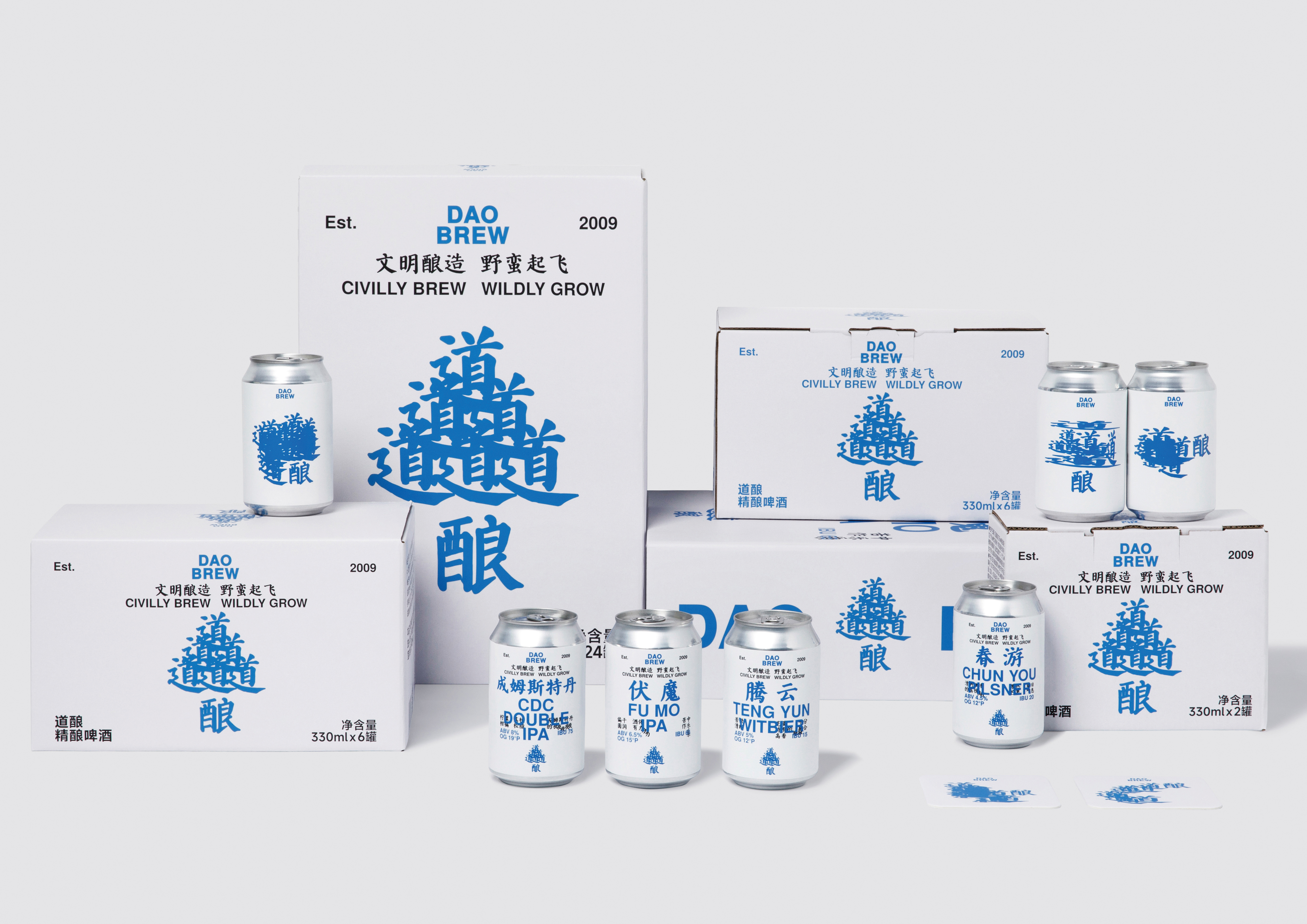
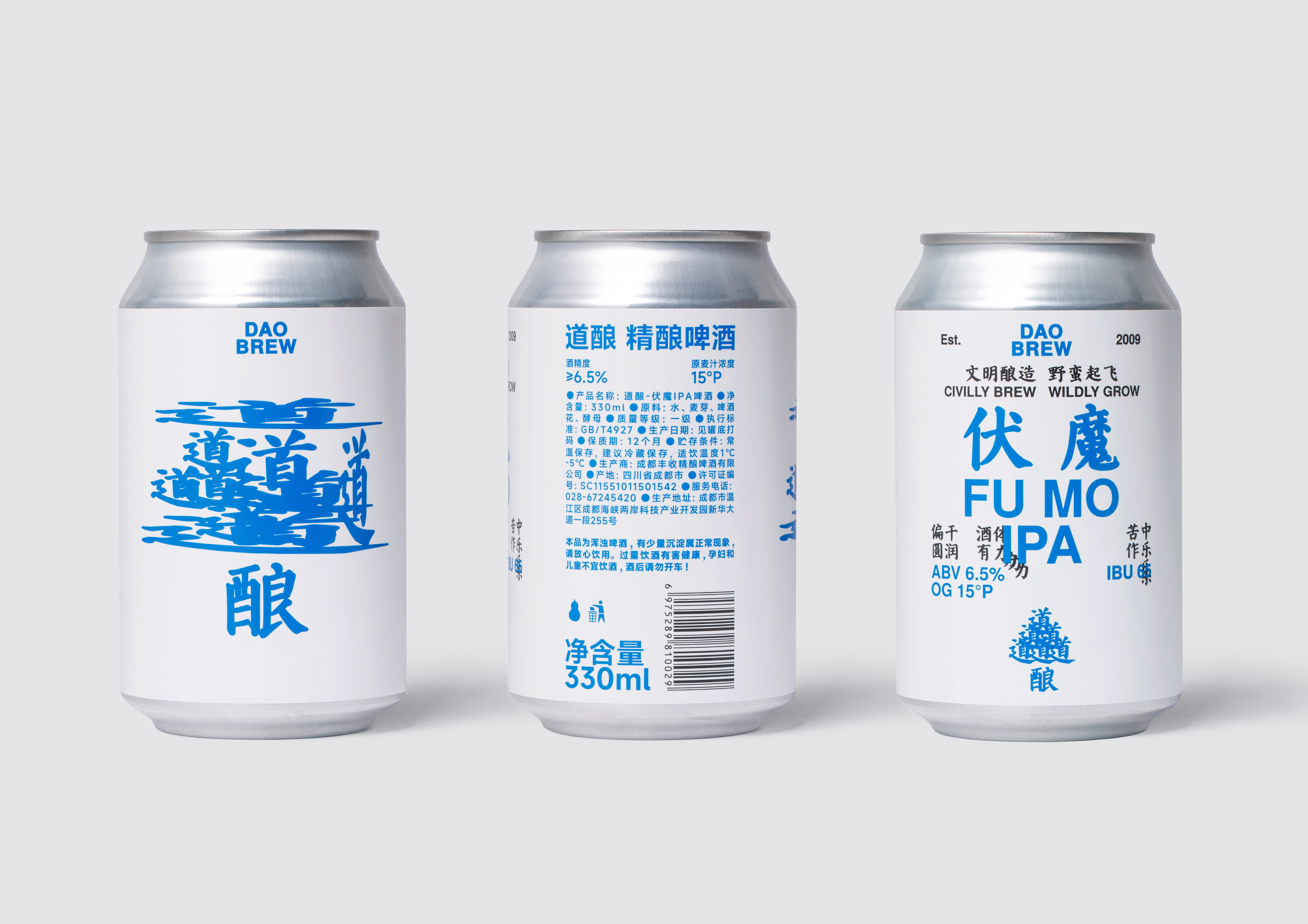
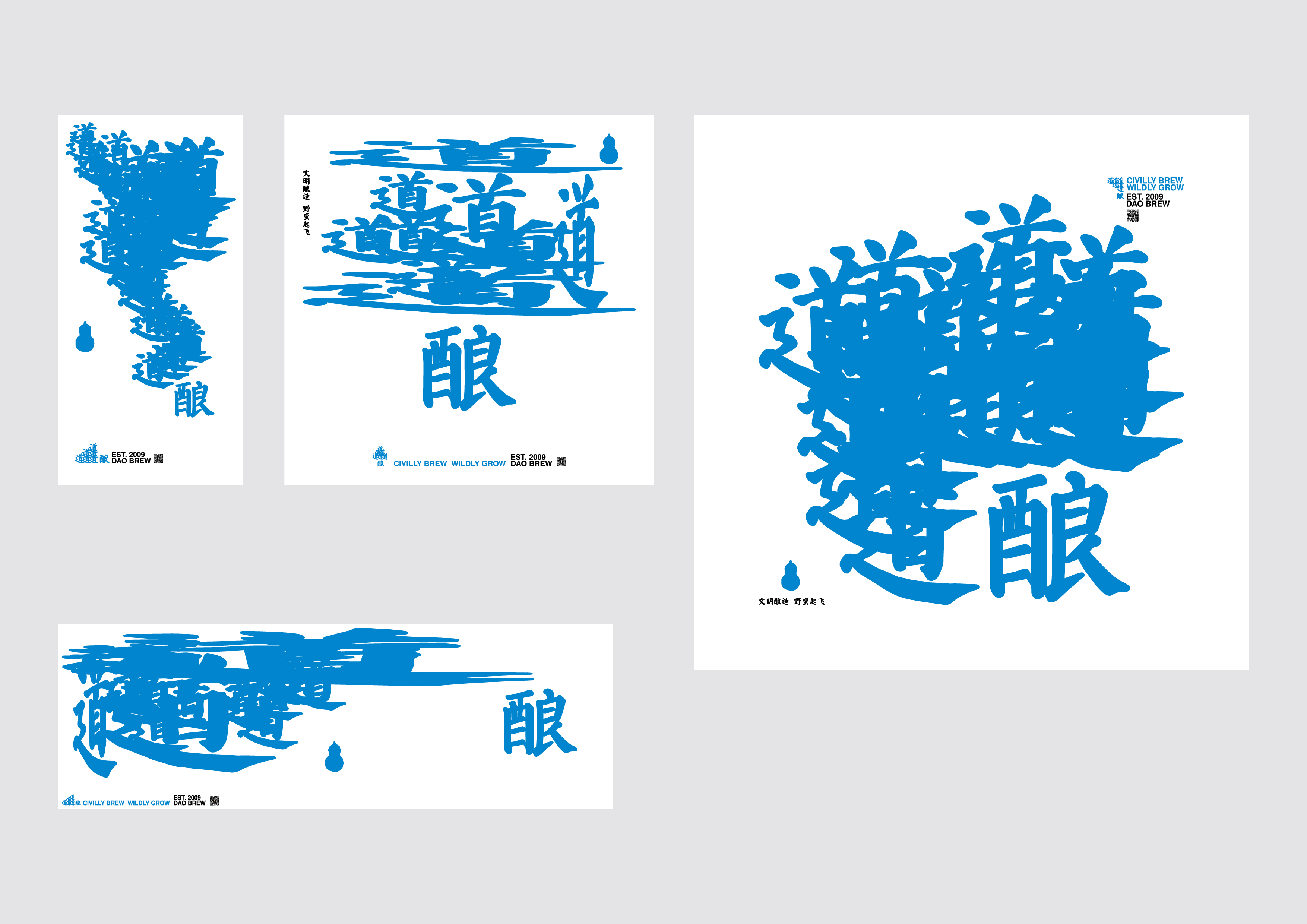
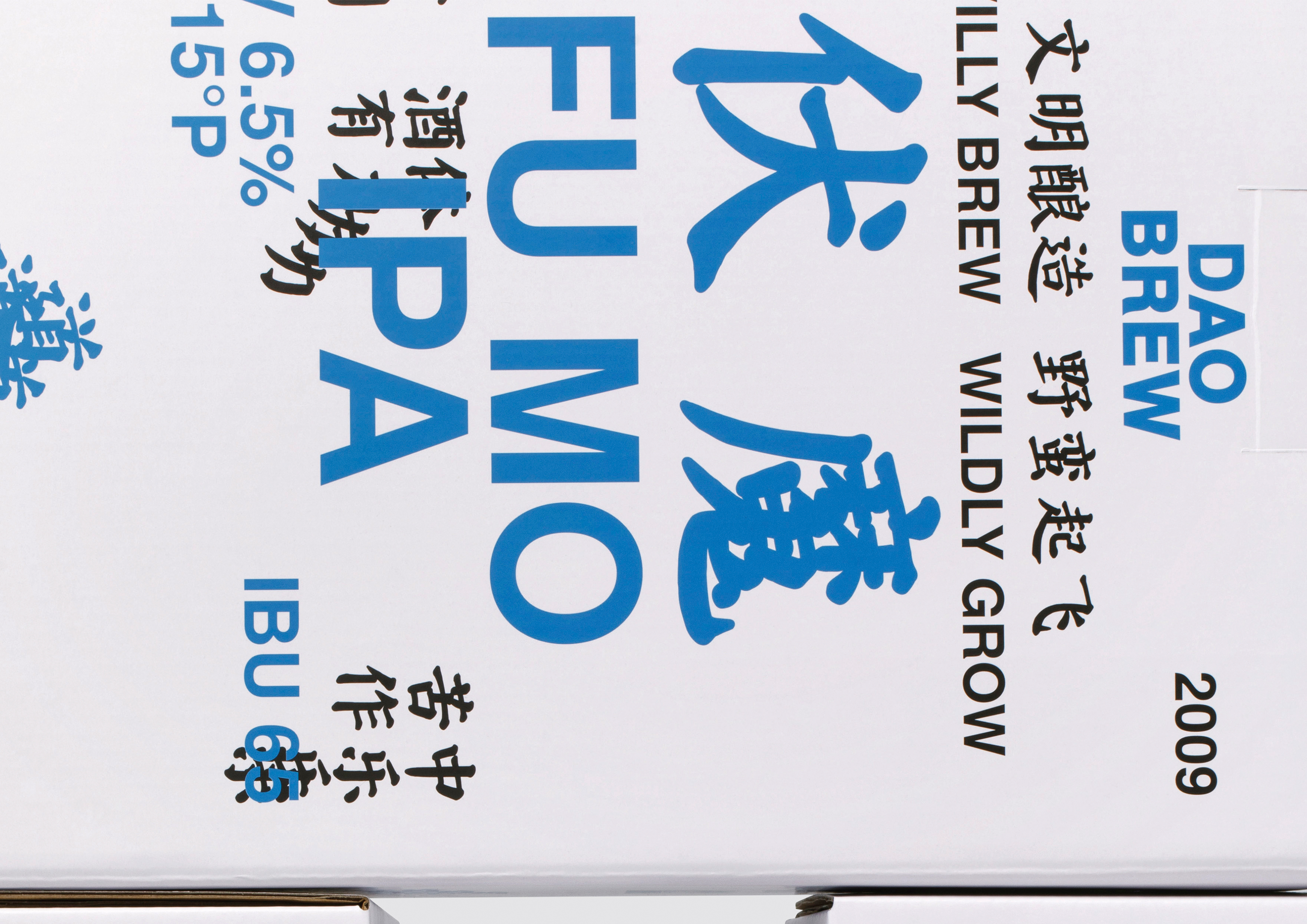
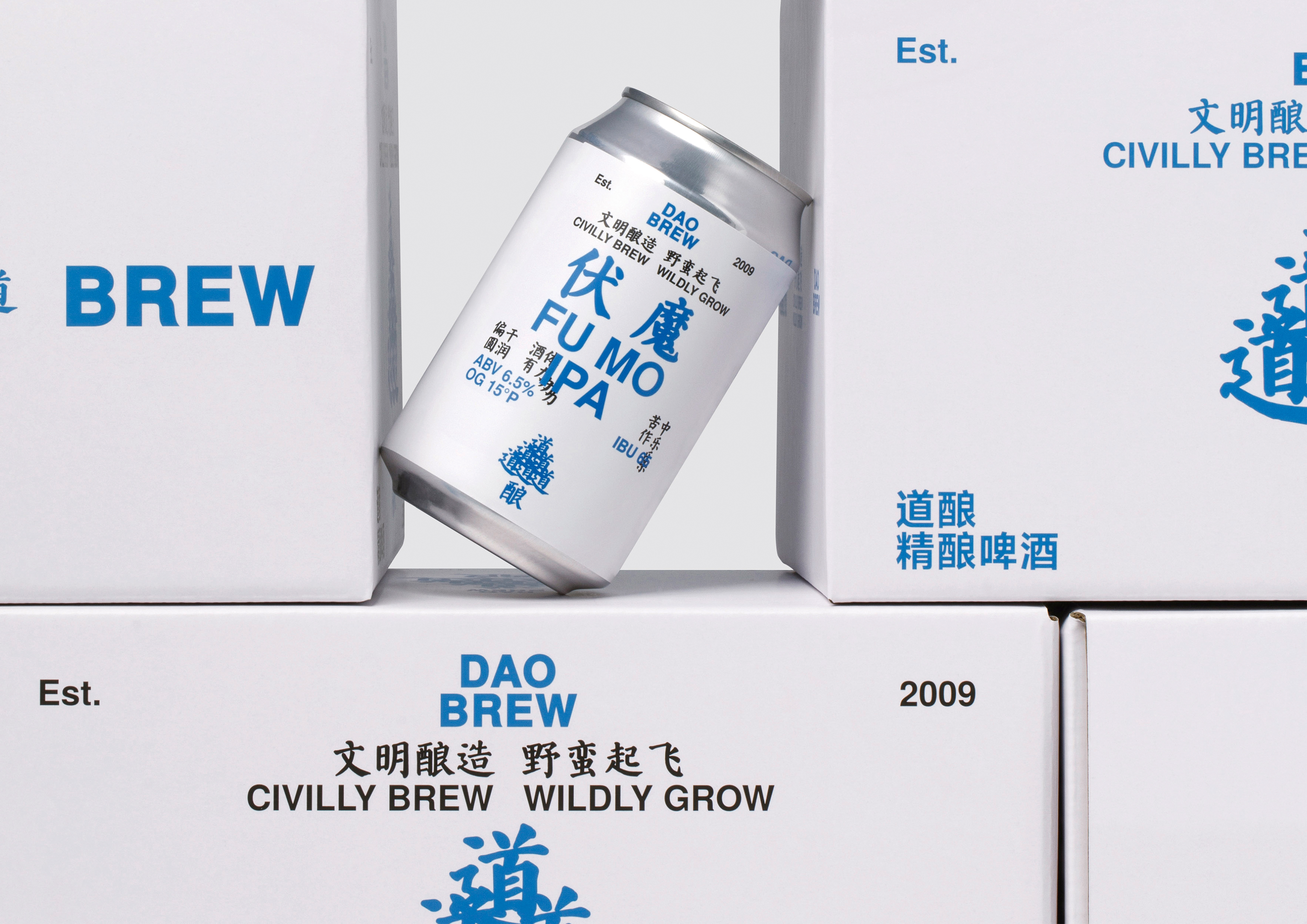
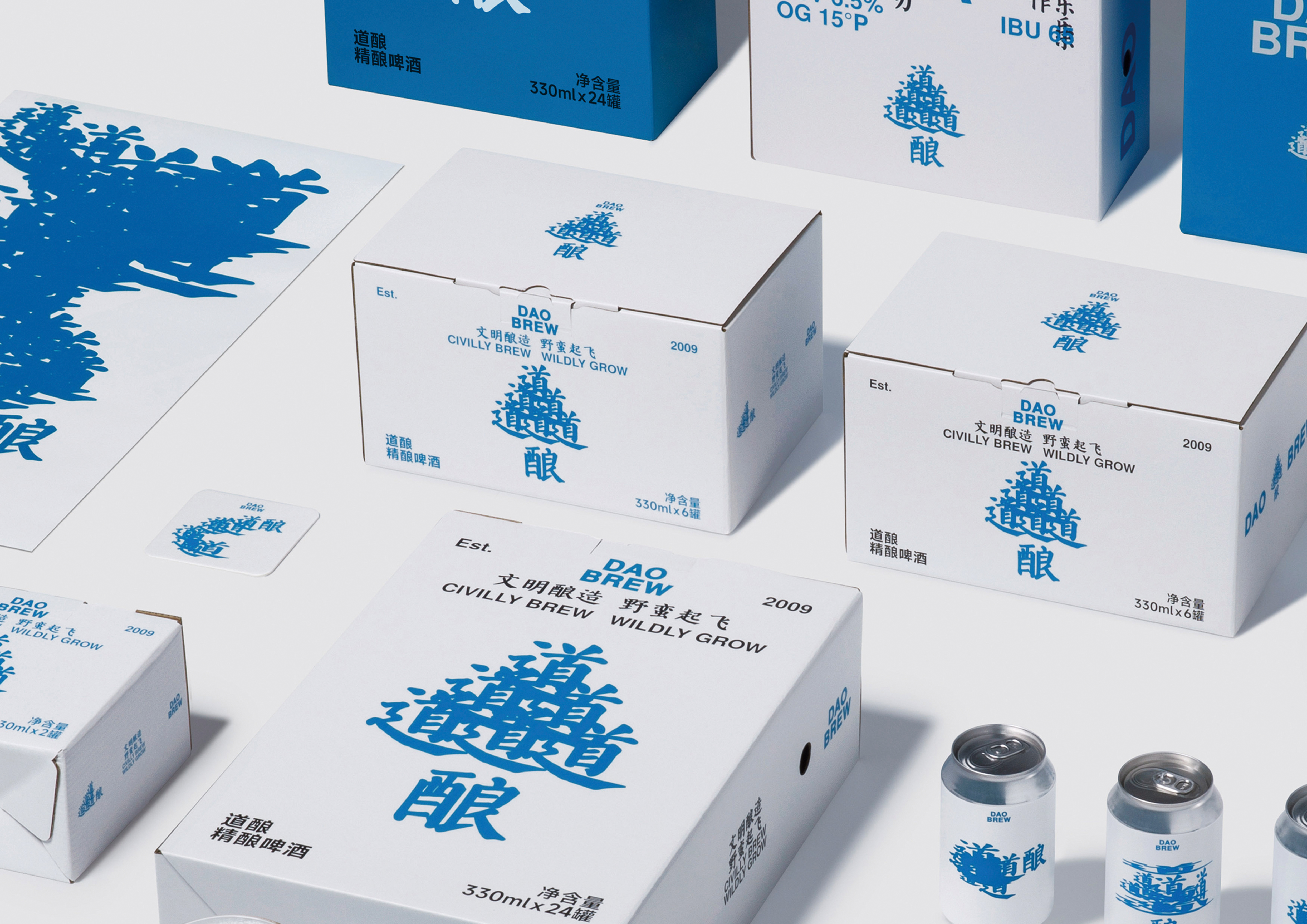
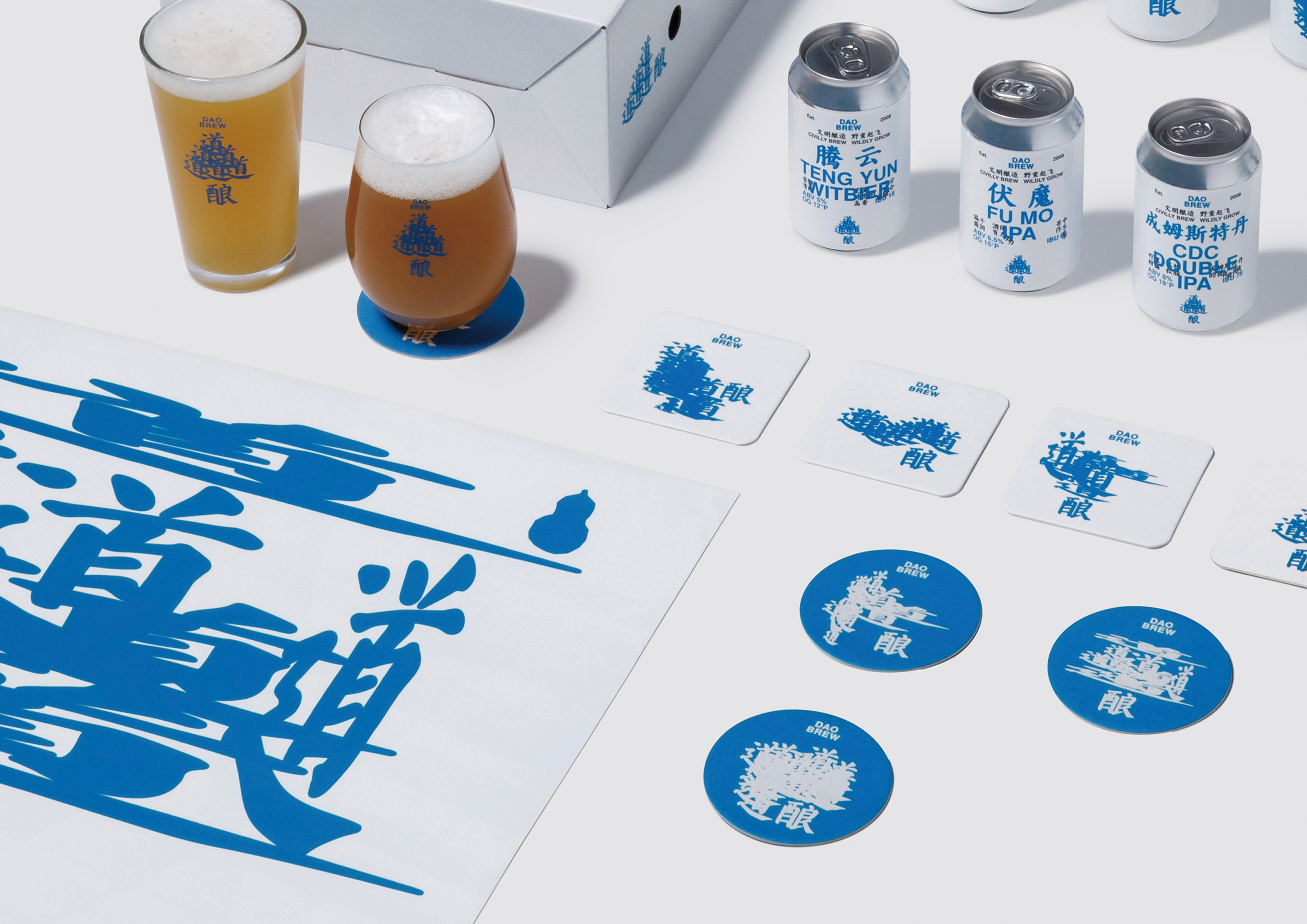
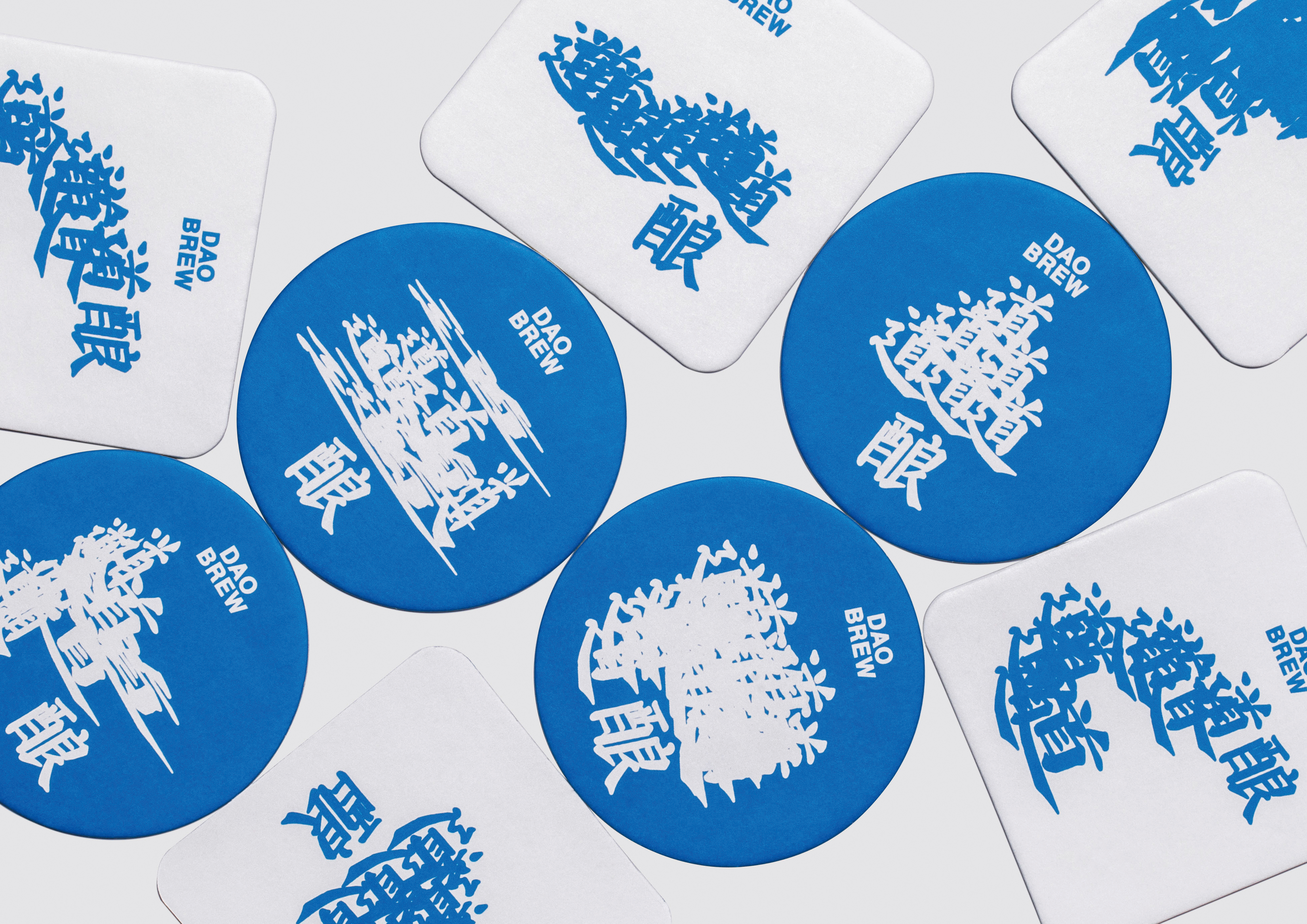
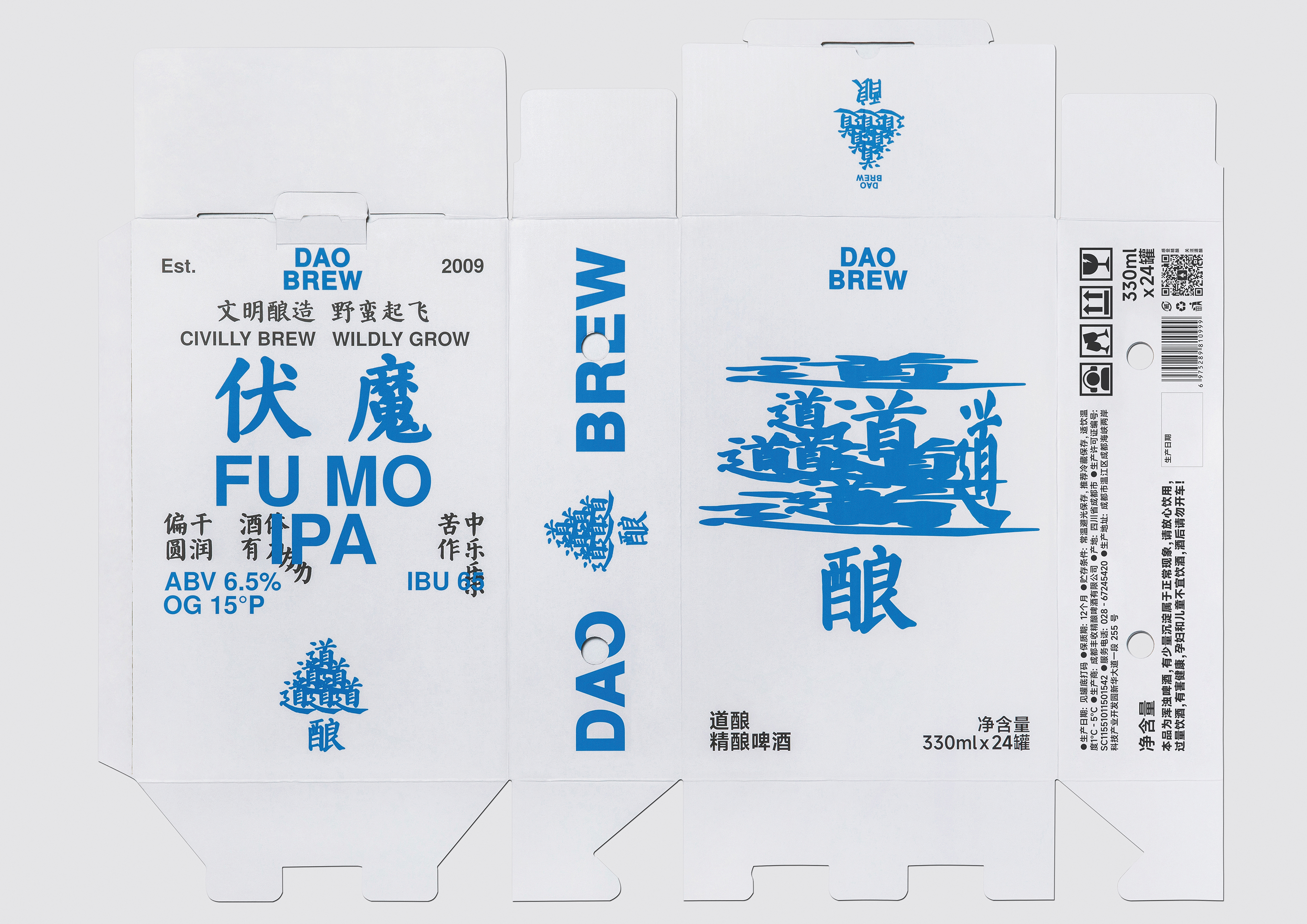
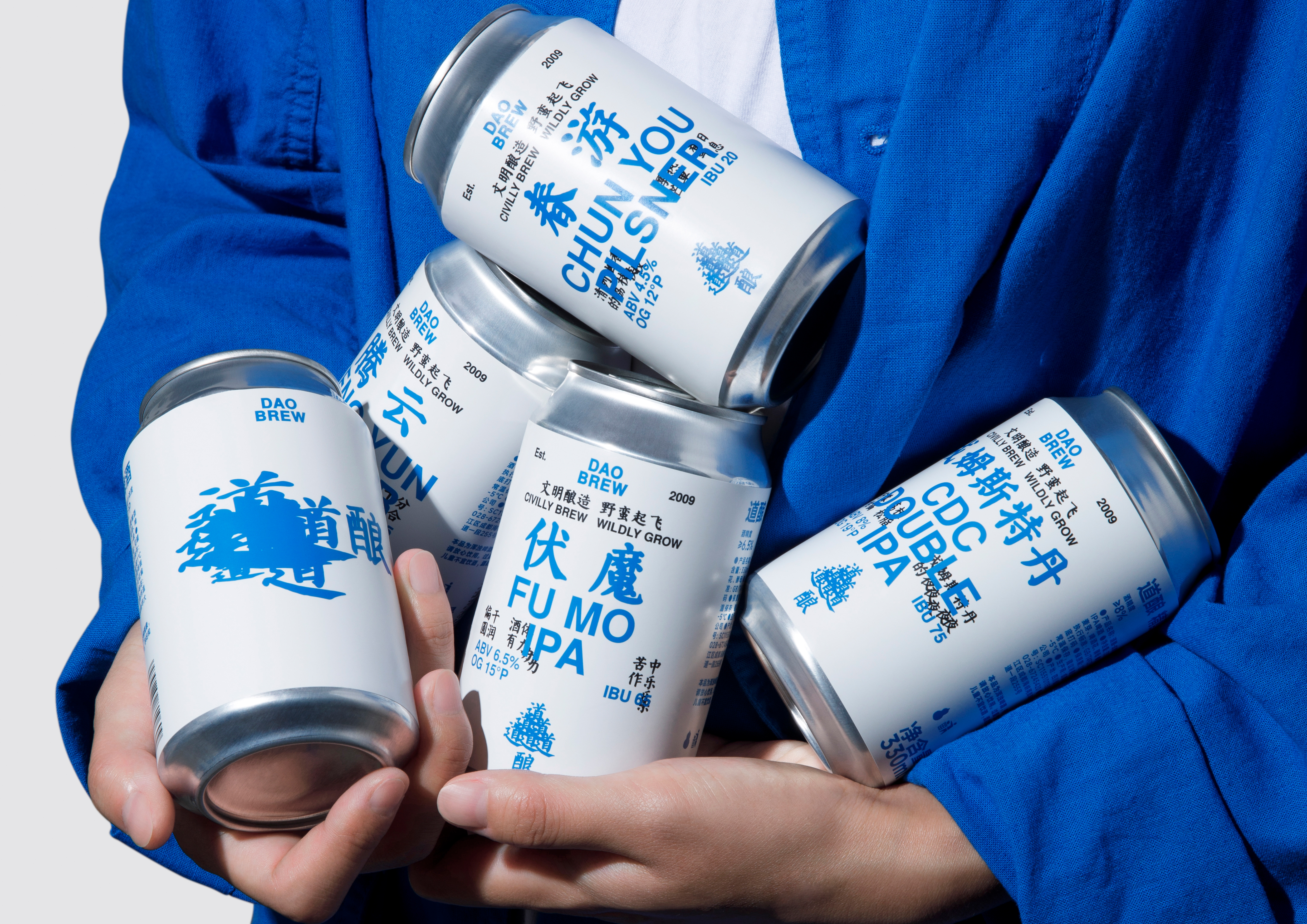
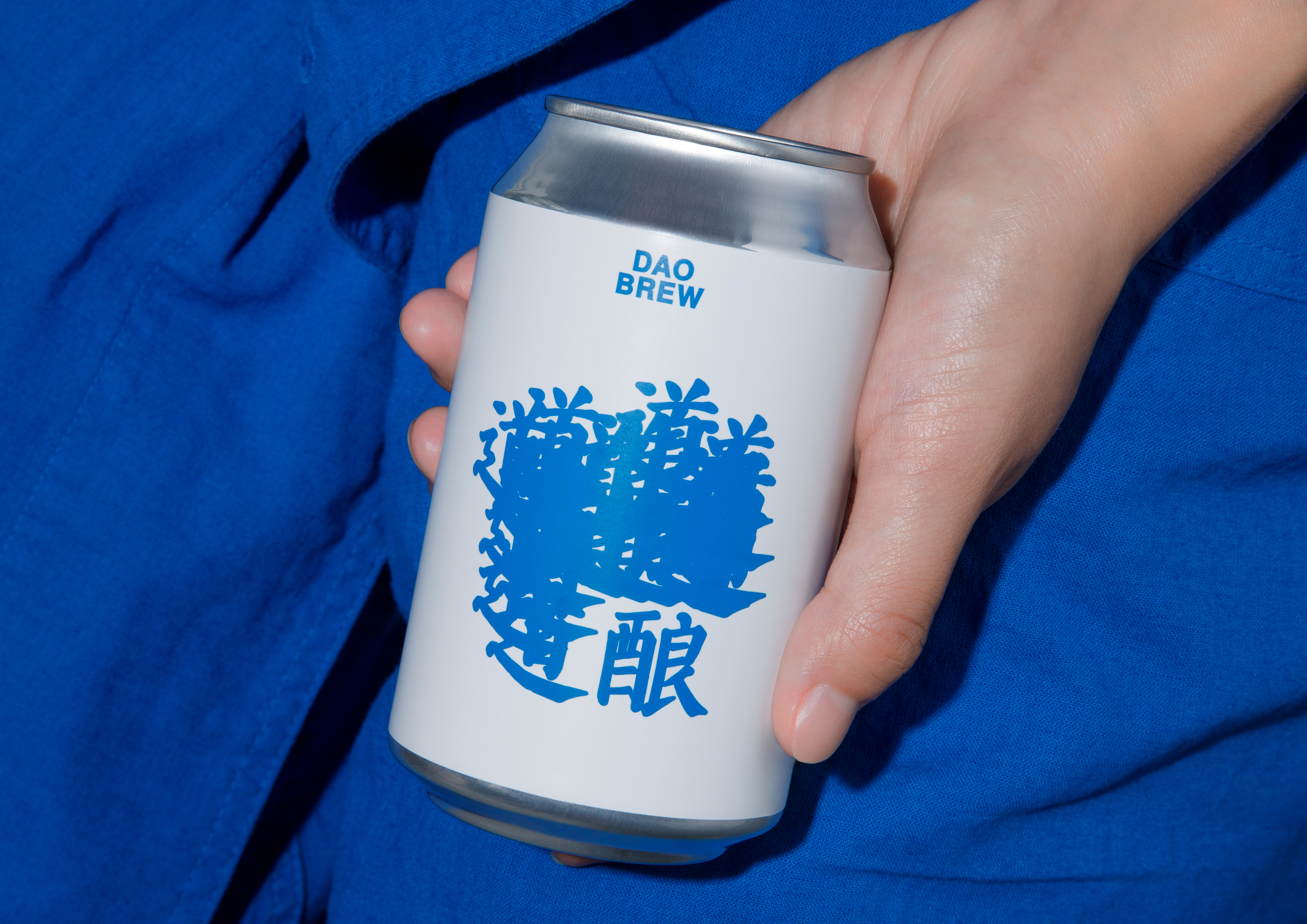
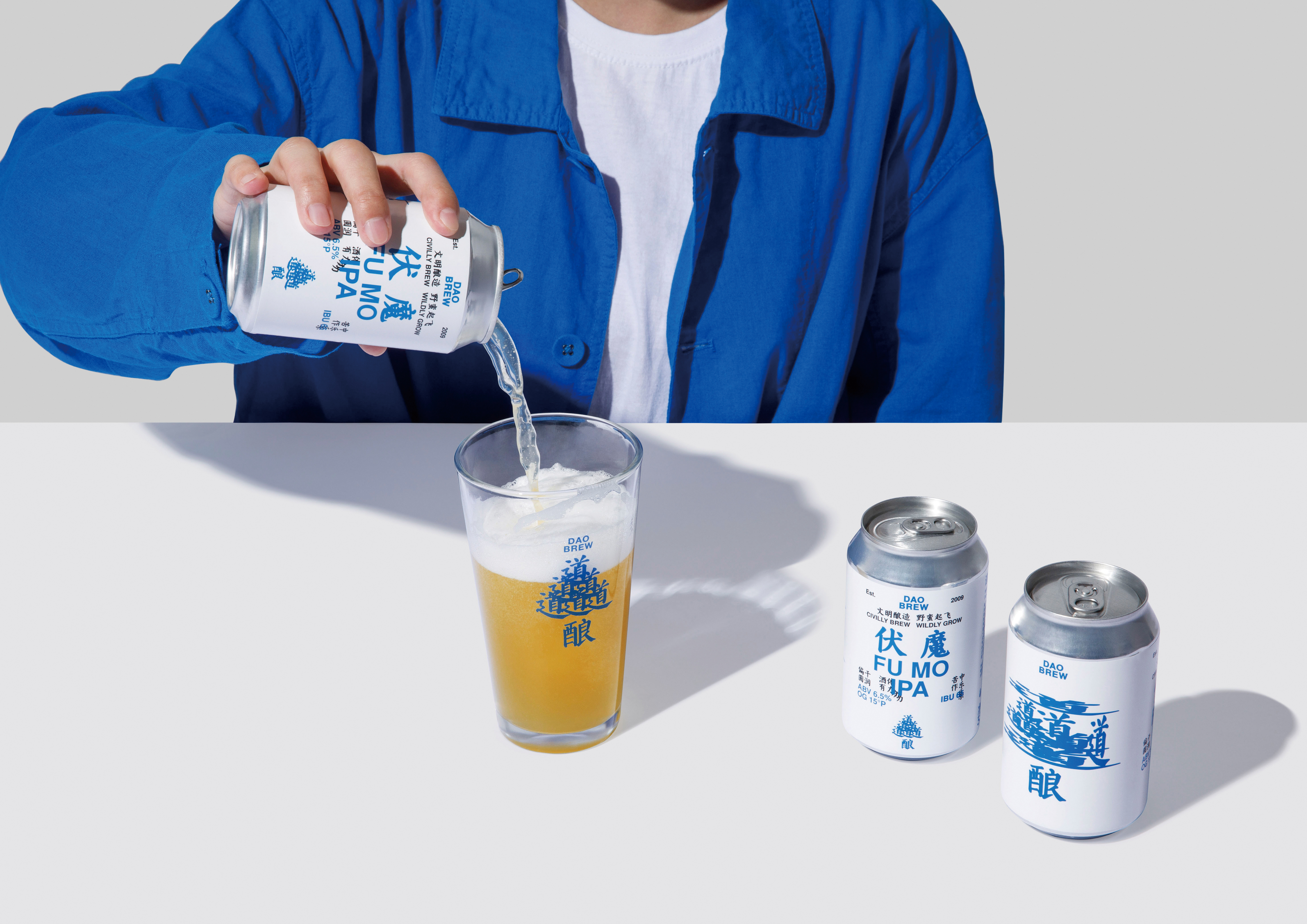
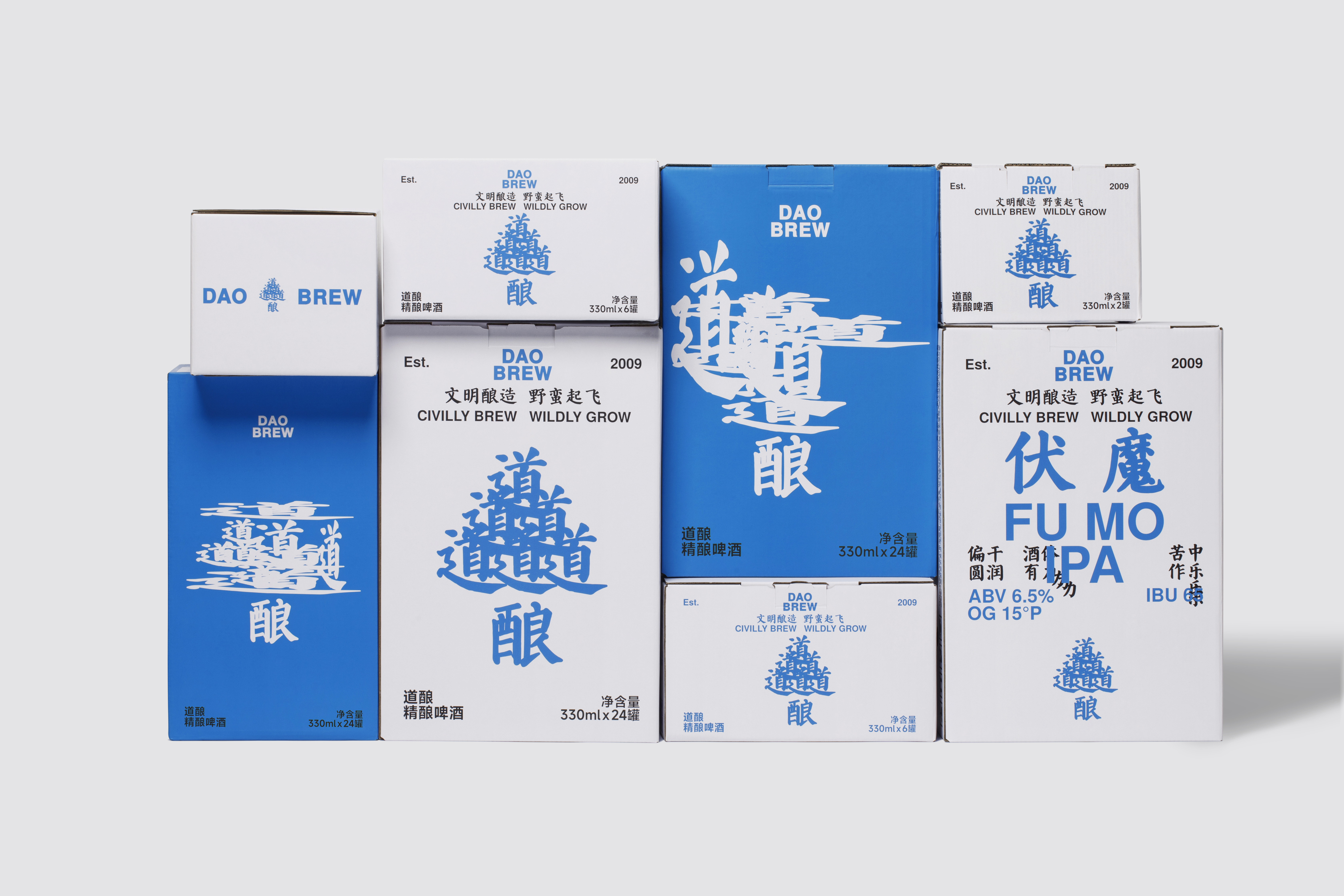
In terms of product packaging design, we have abandoned the previous forms that were mostly dominated by illustrations and abstract patterns, and adopted a more direct and effective text layout method. This not only facilitates consumers at the market end to obtain relevant product information intuitively, but also enables the brand itself to clearly sort out and unify the existing and future different varieties and categories. On the canned beer packaging, we divide the new packaging into A and B sides. The A side is the emotional panel, and the B side is the product information. The text layout of the A-side “道” mainly comes from the product name and features of the B-side.
When consumers encounter the brand's fresh visual identity and product flavors, even for the same product, their understanding and experience may differ. Yet, this might empower the brand even more. This is DAO BREW.
道酿是中国精酿啤酒的先驱者,2009年创立于成都。现品牌旗下20余种原创产品已覆盖各省市自治区,国内首个拥有自己易拉罐罐装线的精酿啤酒厂;道酿在欧洲之星、布鲁塞尔挑战赛、WBA等国际顶级专业啤酒赛事中已斩获多项金奖,现已成为全国规模排名前列的精酿啤酒厂。
全新的品牌设计,遵循着“道”与“酿”展开,以文字的方式传达产品信息和拓展想象的边际;“道”的多样性、不确定性、无序、混沌、自然天真的本性,强调品牌和产品对“意境”的营造,道可道,非常道。在道酿的VI中我们试图通过文字去叙事和抒情、平淡的、轻松的、愉悦的、悲伤的、激动的,逍遥的、自在的等等。“道”的无序排版即是对应某款产品、又好像是某种意境的呈现,就好比产品风味描述,每个人的感受都有所不同。作为消费者来说,风味描述的方向是需要的,但又不是绝对的。从整体看,作为品牌视觉最终达成的某种不谋而合的统一性; “道”的不同呈现。尽管大家面对的是同一个画面,每个人的理解一定有所不同,但这样或许会更具有力量。
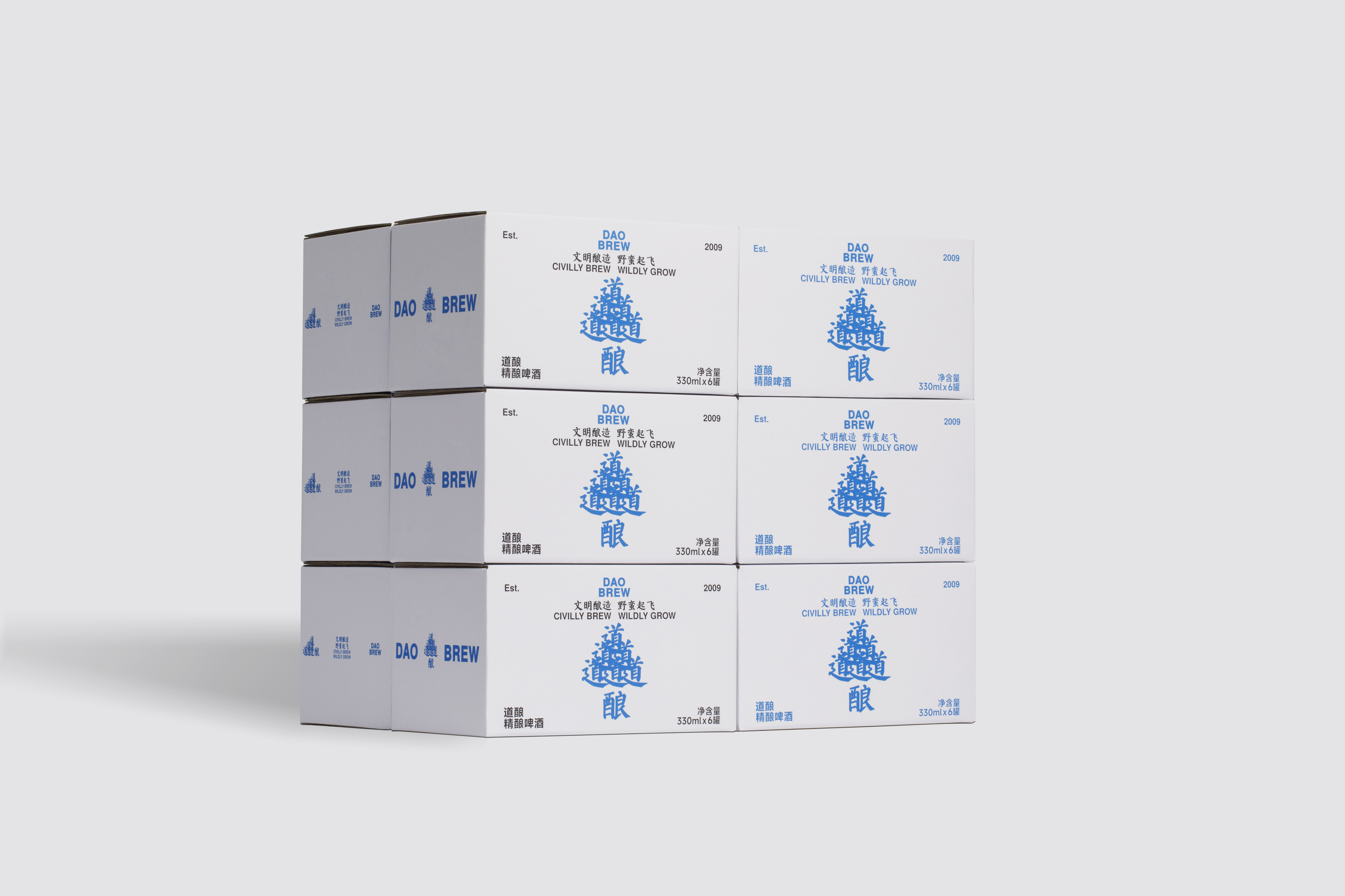
在产品包装的形态设定上,我们摒弃了以往自身和行业大多以插画、抽象图案为主的形式,采用更直接有效的文字排版方式、这不仅方便市场端的消费者直观的获取相关产品信息,也让品牌自身可以清晰梳理和统一现有和未来的不同品种品类。以罐装啤酒包装为例,我们把新包装分为A、B面,A面为情绪面板,B面为产品信息,A面“道”的状态文字排版主要来源于B面的品名和特征。新品牌以特有的蓝色为主色调、白色为基底,在传承多年道酿的品牌色的基础上,优化升级了色彩的年轻化和时尚感。增加了版式内容的趣味性和逻辑与层次关系。
在商业上,我们希望全新的视觉升级逐渐是让道酿从小众到大众的认知度和识别度的工作。同时,明确与强化品牌独特的基因与理念。如同品牌的Slogan:“文明酿造,野蛮起飞”,这即是道酿。
DAO BREW
道酿
ART DIRECTOR: Xiao Nan
DESIGNER: Kai Chang
CLIENT: 道酿 DAO BREW
YEAR: 2023