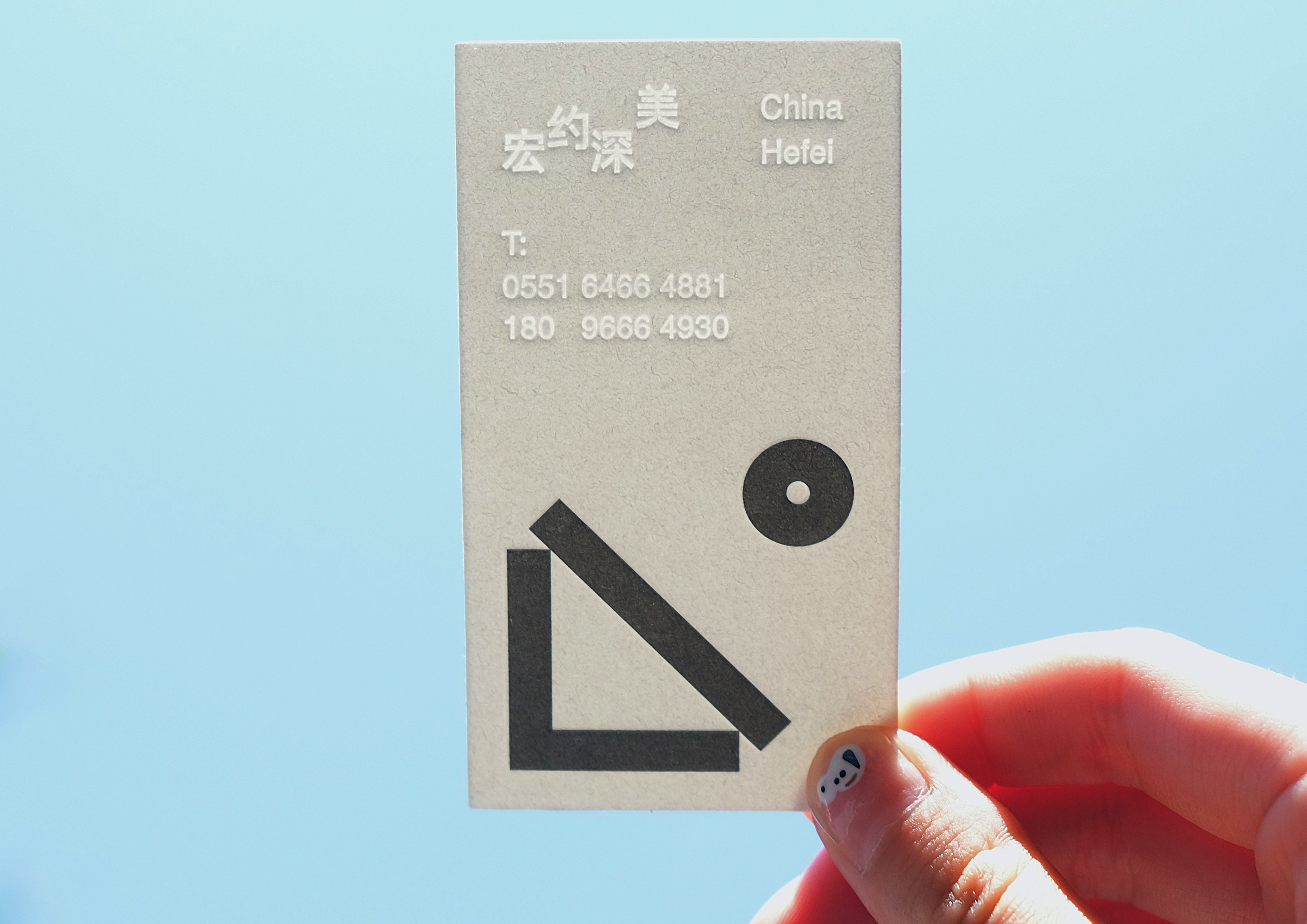
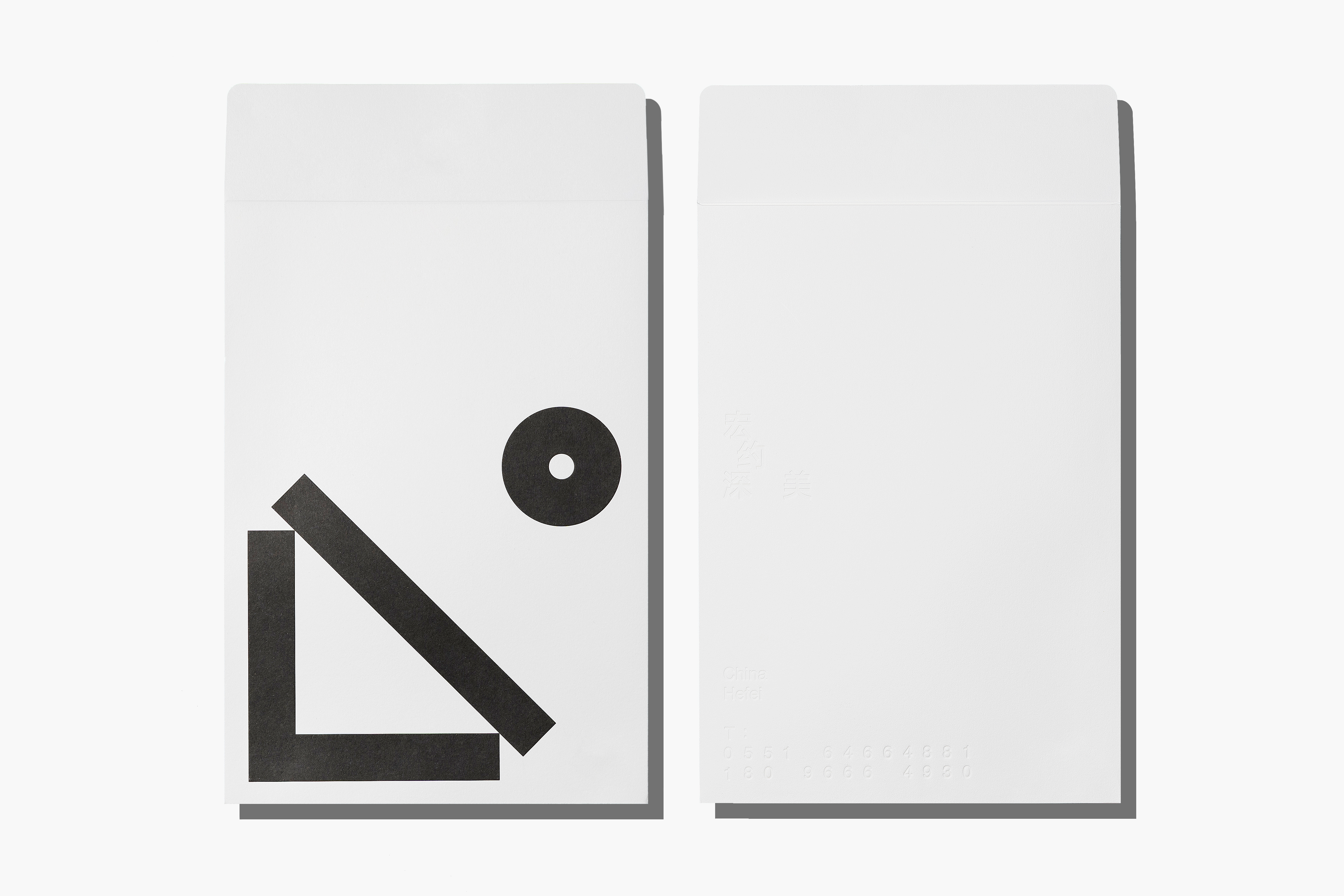
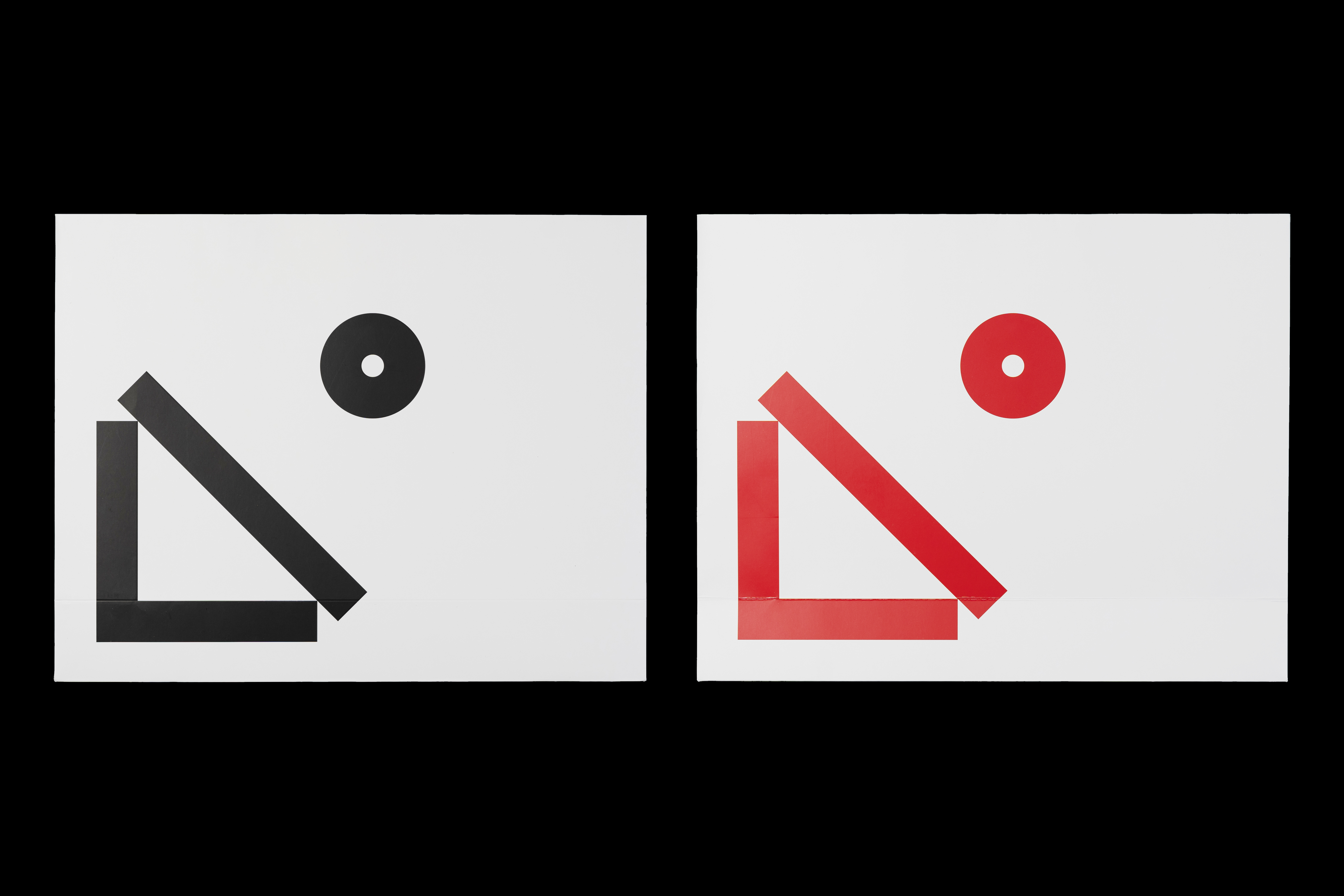
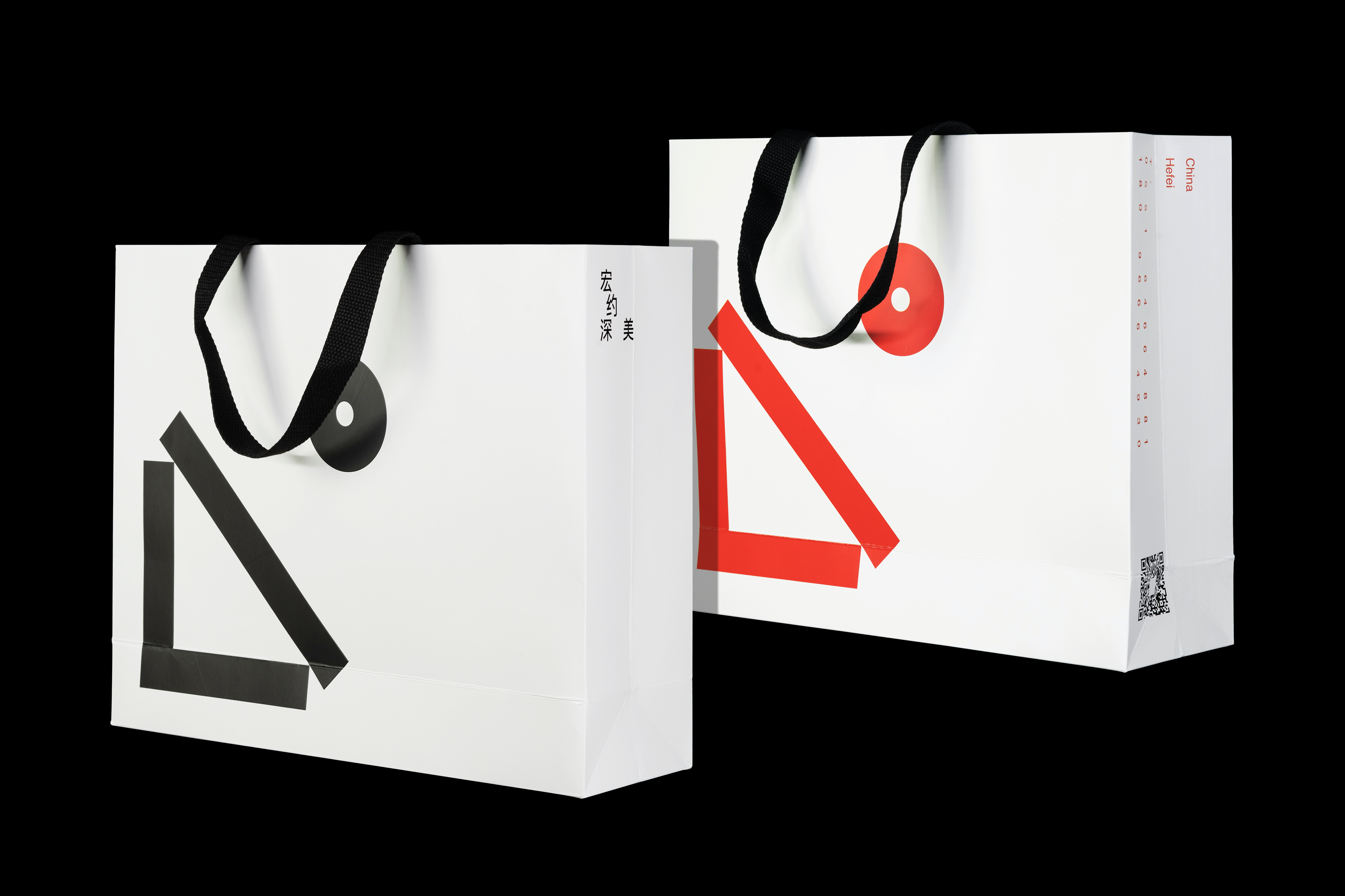
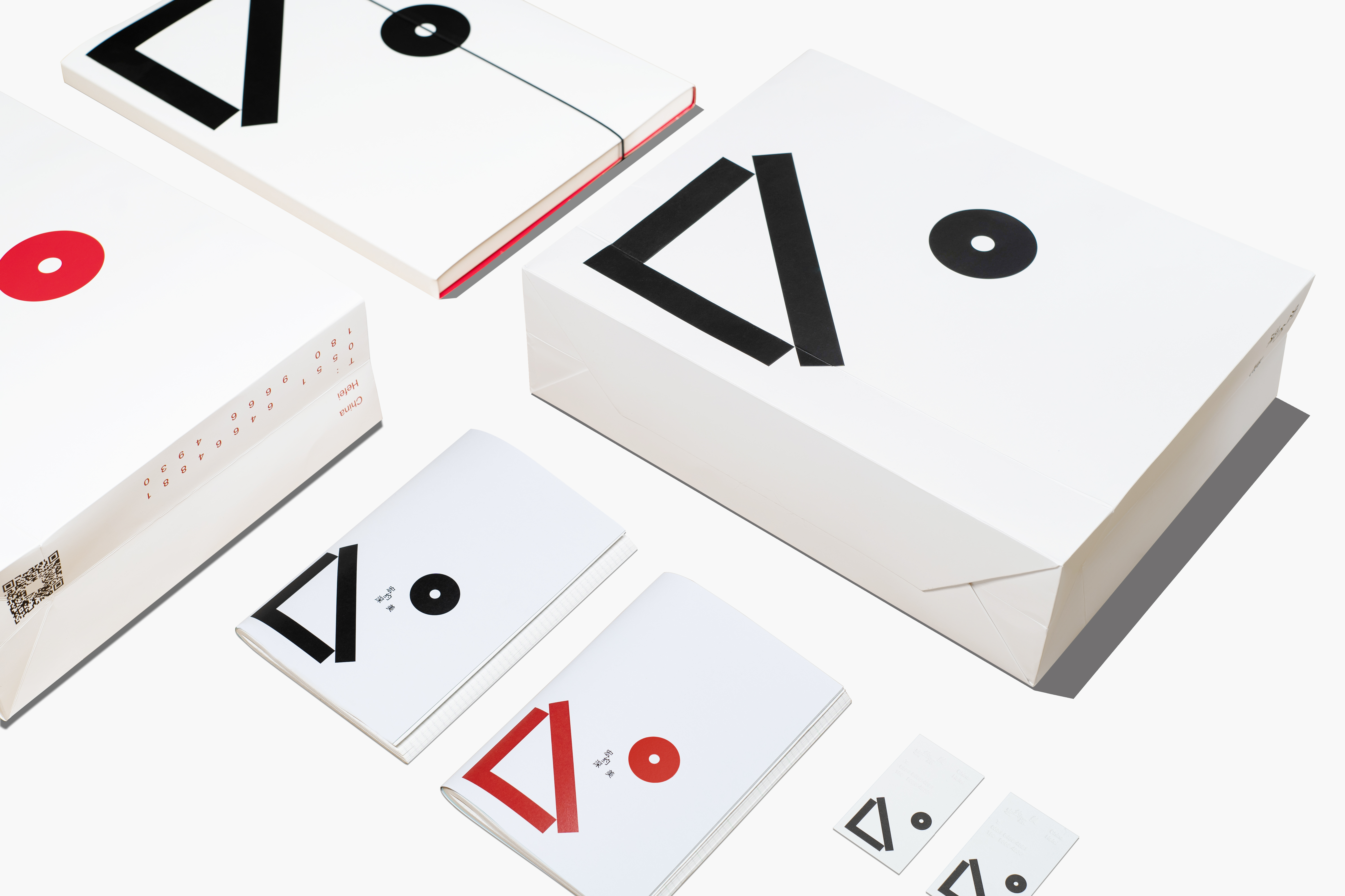
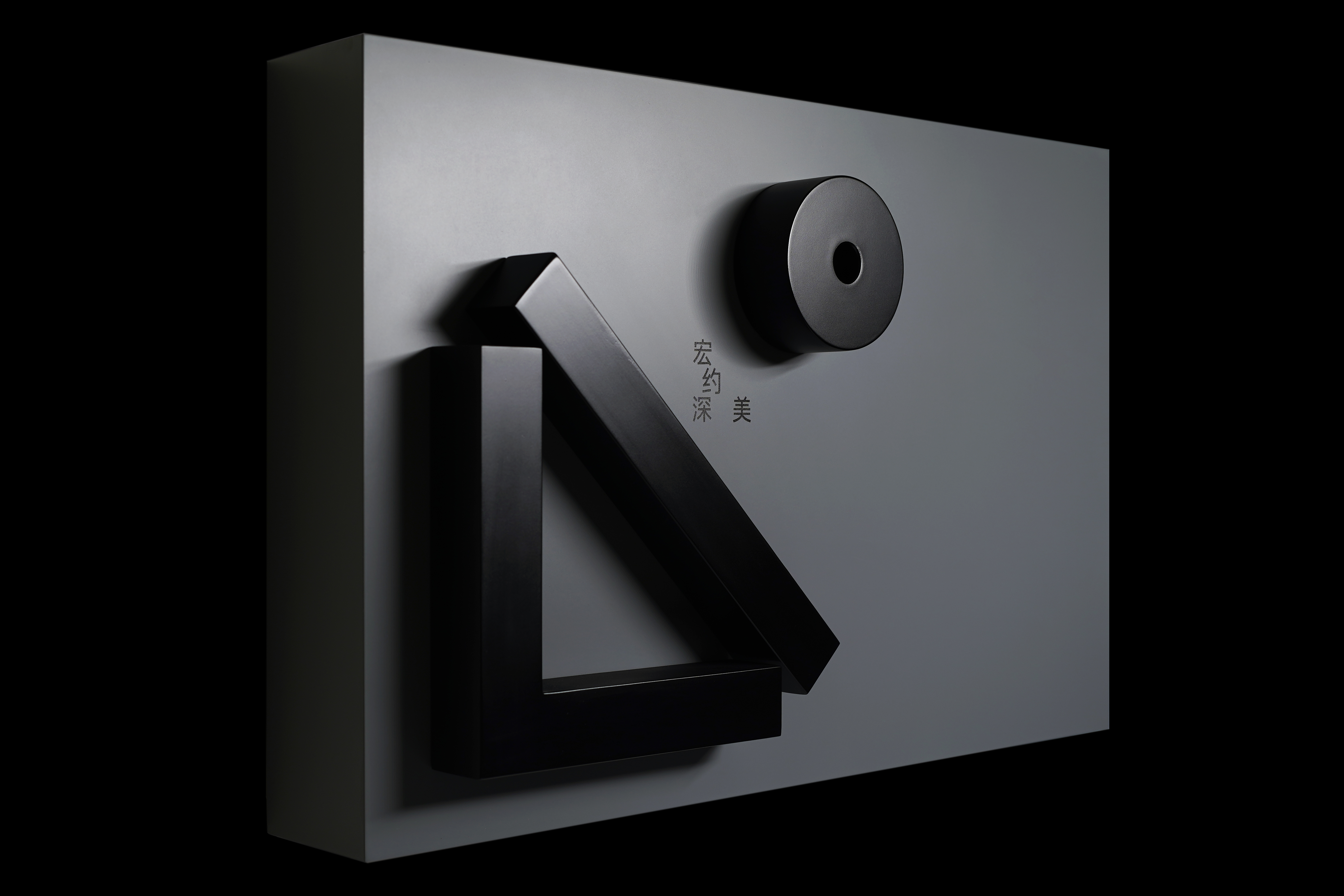
In the brand design of ‘Hong Yue Shen Mei’, we have been looking for appropriate graphics to express these four sincere and beautiful words.After numerous attempts, we finally choose isosceles right triangle as the graphic symbol of the whole brand.Isosceles right triangle is special and unique.The horizontal and vertical sides represent "grand" and "profound" respectively, which are equally important. The hypotenuse means "constraint". The relationship between the three is relative.Therefore, in the detail processing of graphics, we do not completely close the graphics structure, which also provides a certain space for the design to play a balanced role in all aspects.The circle is the inscribed circle of the isosceles right triangle. We believe that there is no absolute perfection, and this balance of beauty is what we go after.
In our opinion, ‘Hong Yue Shen Mei’ conveys its own design concept with a clear and strong new visual identity in such a competitive industry of interior design, which is very encouraging and praiseworthy.
在宏约深美的设计中,我们一直在寻找合适贴切的图形以便于表达这四个真诚美妙的字。经过无数次的尝试后,最终我们选择等腰直角三角形作为整个品牌的图形示意,等腰直角三角形是特殊的,独特的,横边与竖边分别代表“宏大”与“深远”,它们同等重要,斜边即是“约束”,三者的关系是相对的,因此我们在细节的处理上没有完全封闭,这也是使设计在各方面发挥平衡作用而留有空间。圆即是等腰直角三角形的内切圆,我们认为没有绝对的完美,这种平衡之美是我们追寻的方向,同样,字体排版与图形同样随之呼应。作为一个空间设计品牌,宏约深美即是希望展现出平衡、协调、以人为本的设计观念。
在我们看来,宏约深美在室内设计如此竞争激烈的行业中、以明确、强烈的新品牌形象设计传达自身的设计理念,这是非常值得鼓舞和赞叹的。
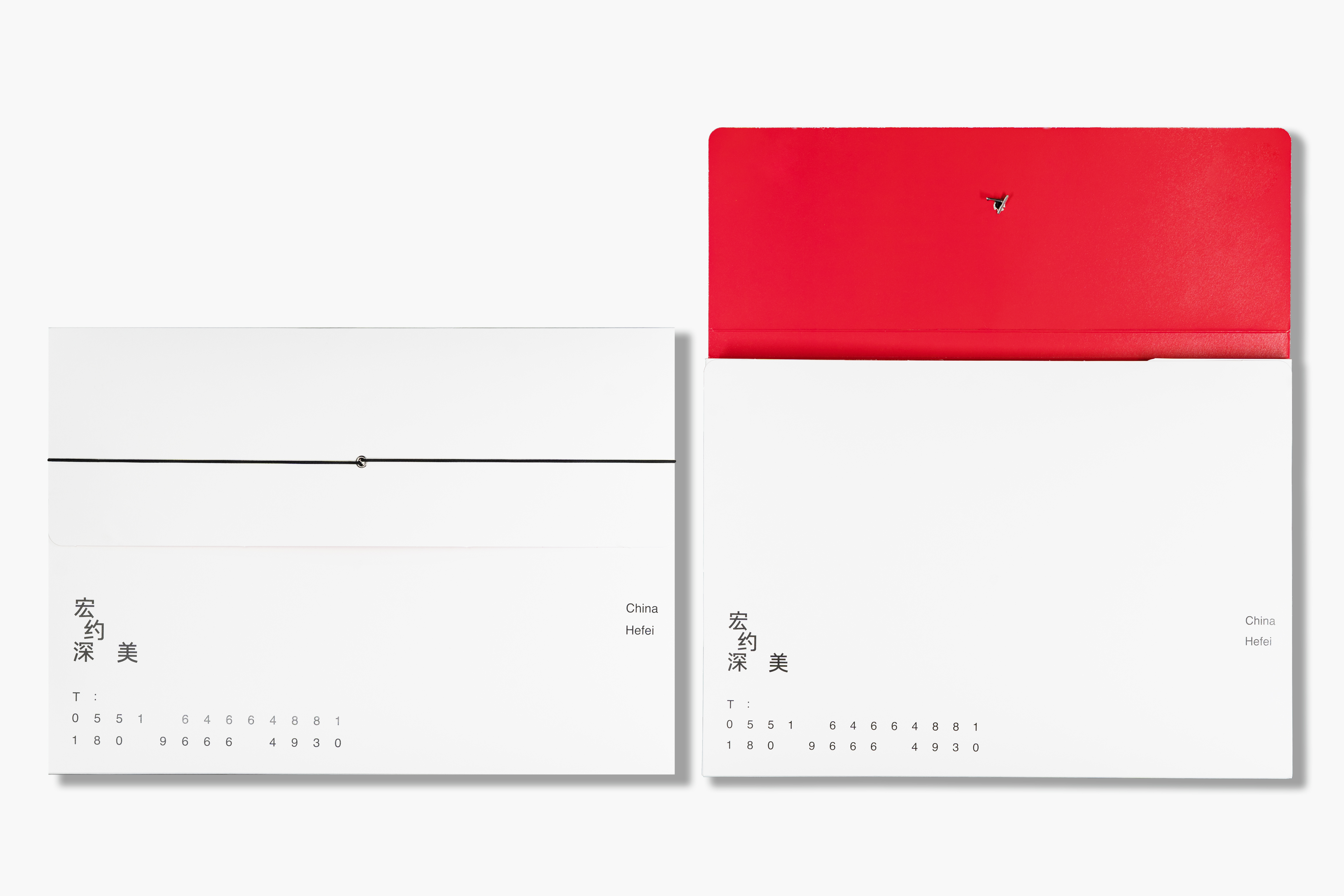
宏约深美
ART DIRECTOR: Xiao Nan
DESIGNER: Kai Chang
MOTION DESIGN: Huang Qian
CLIENT: Hong Yue Shen Mei
YEAR: 2022