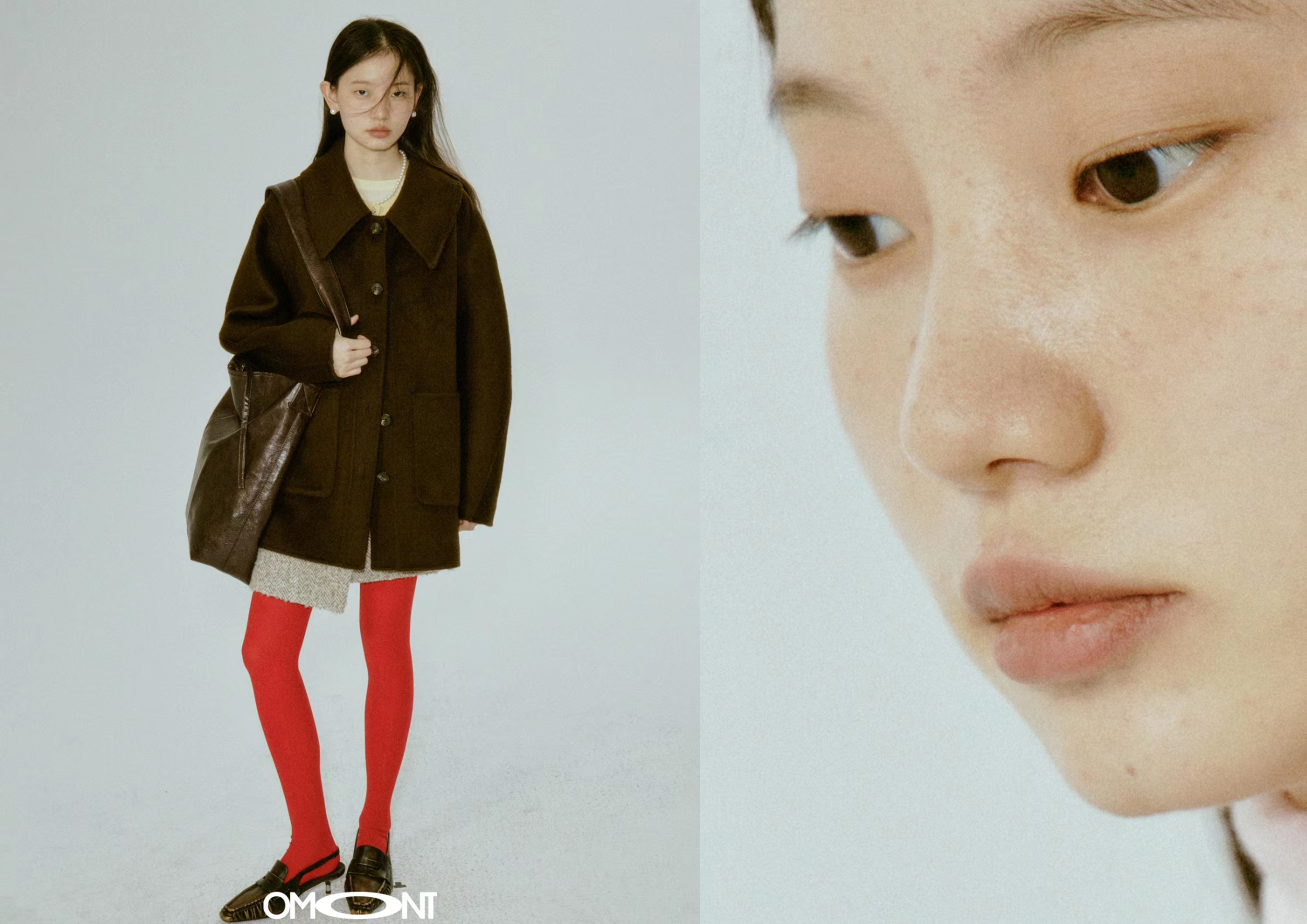
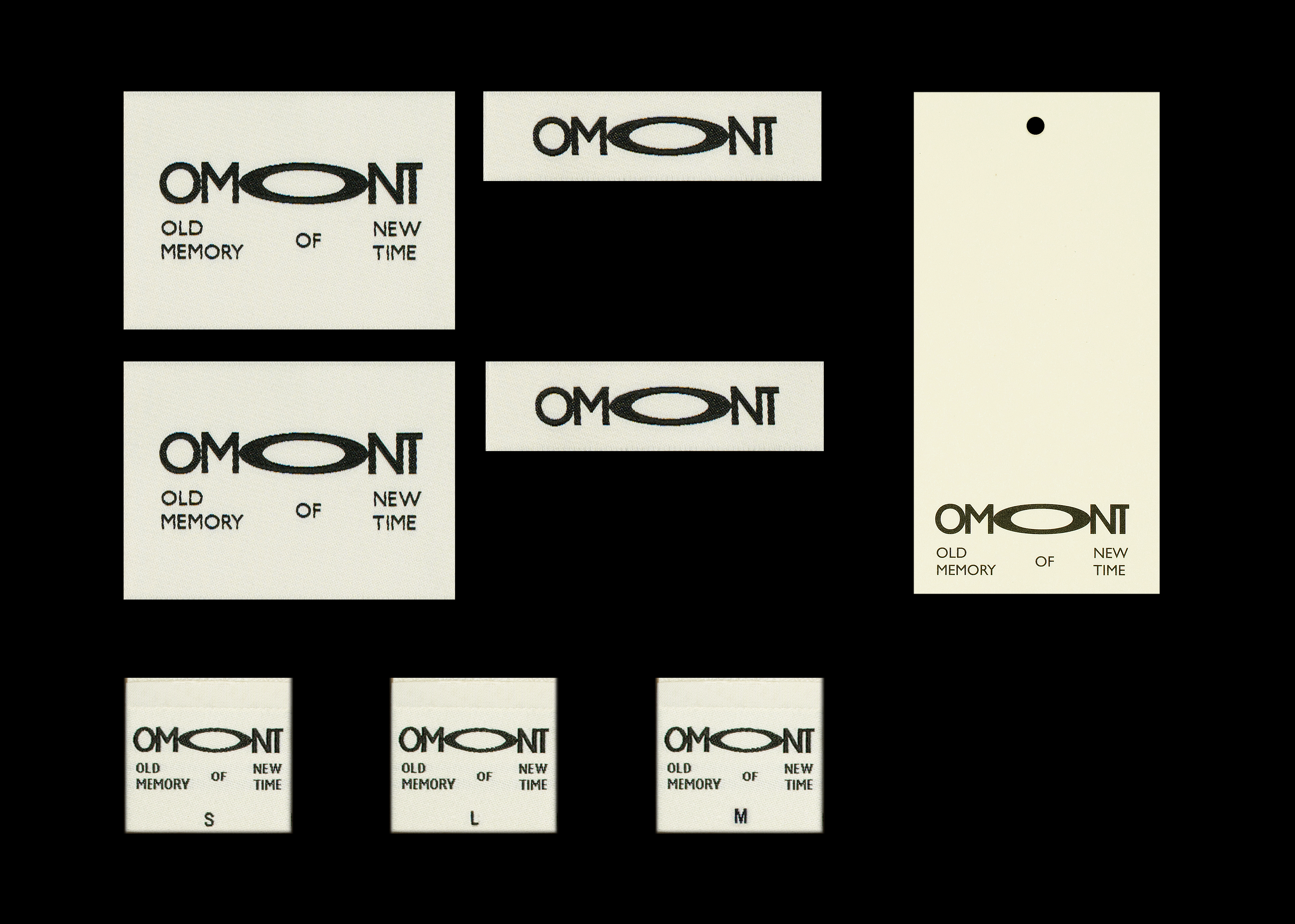
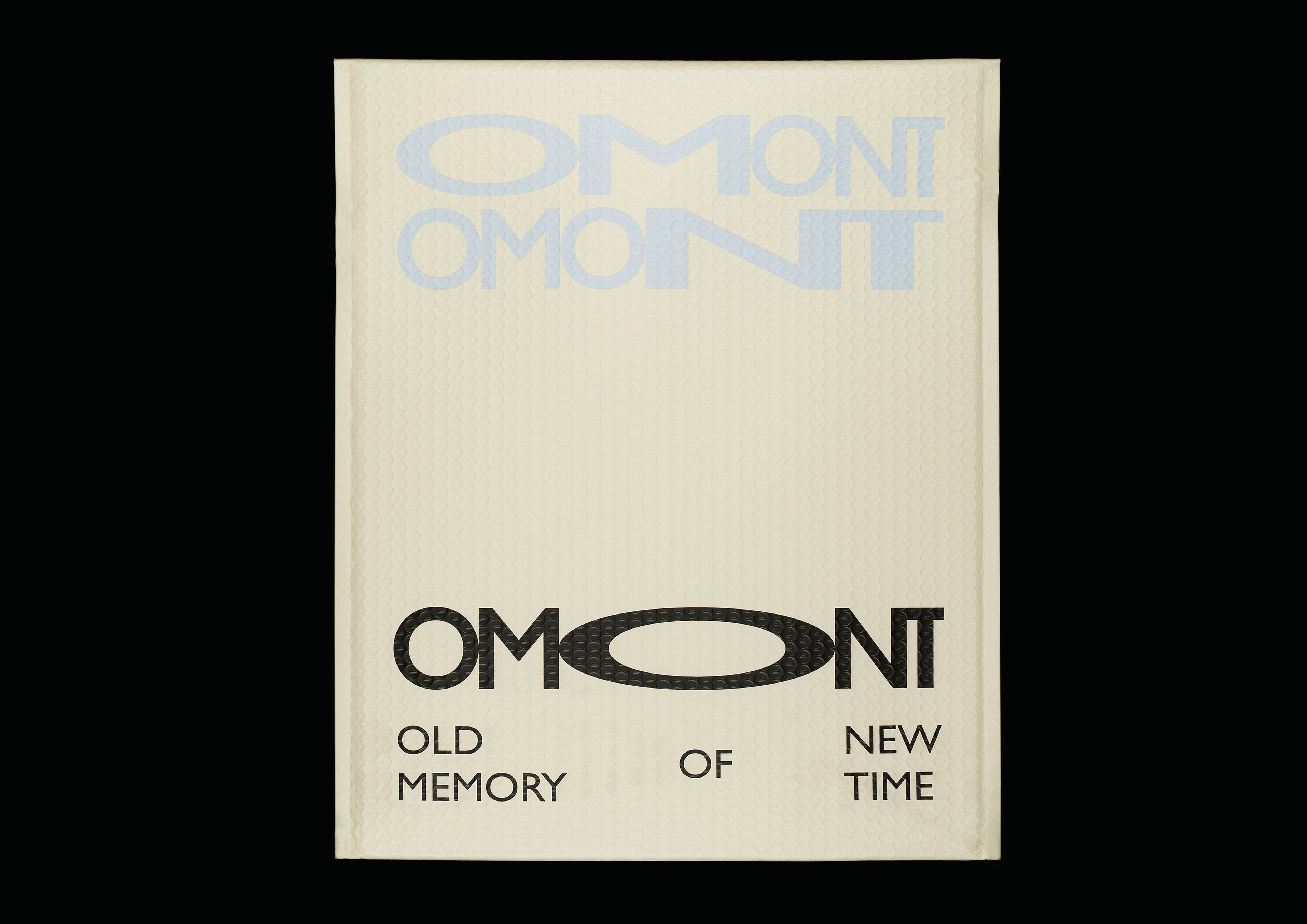
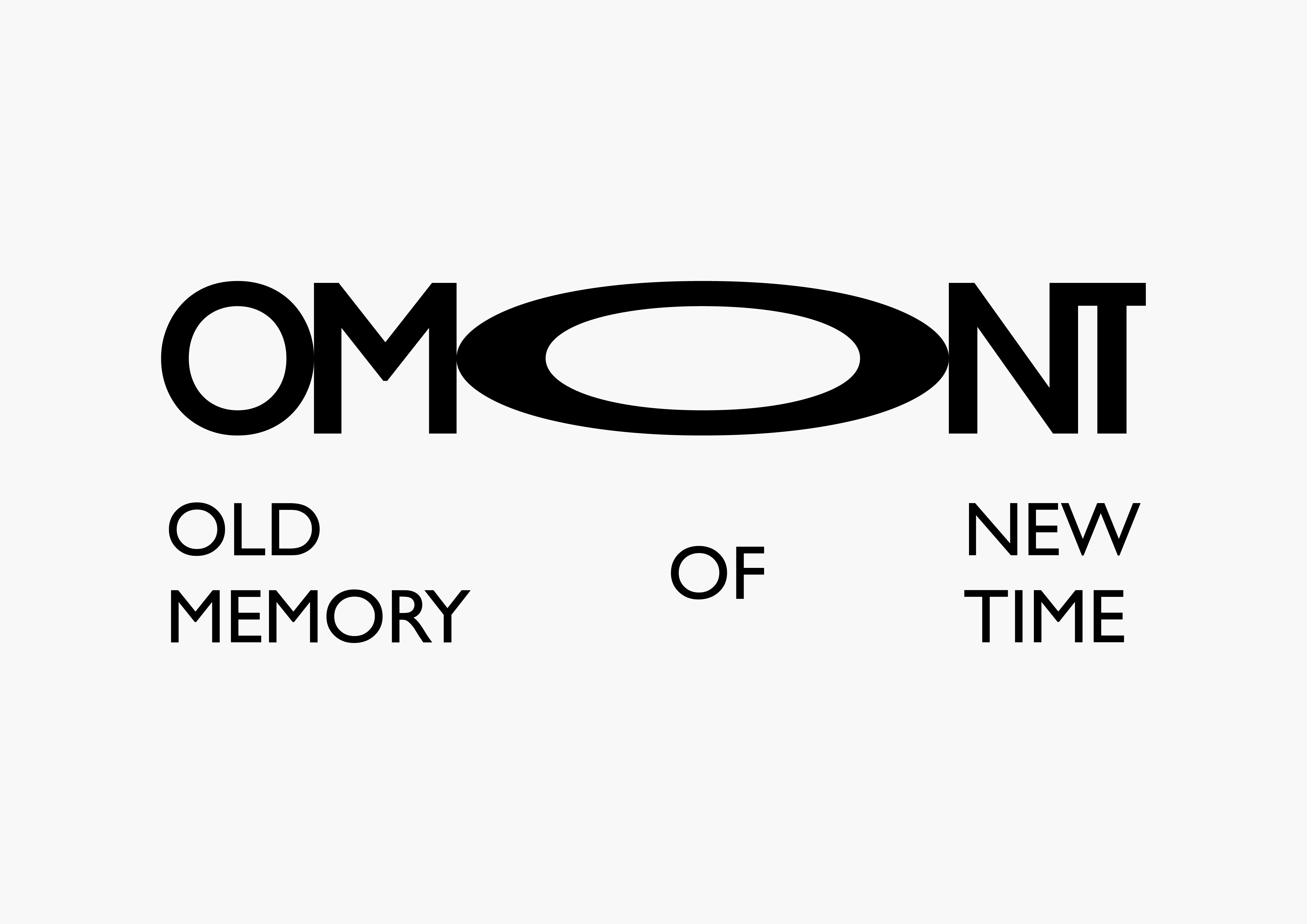
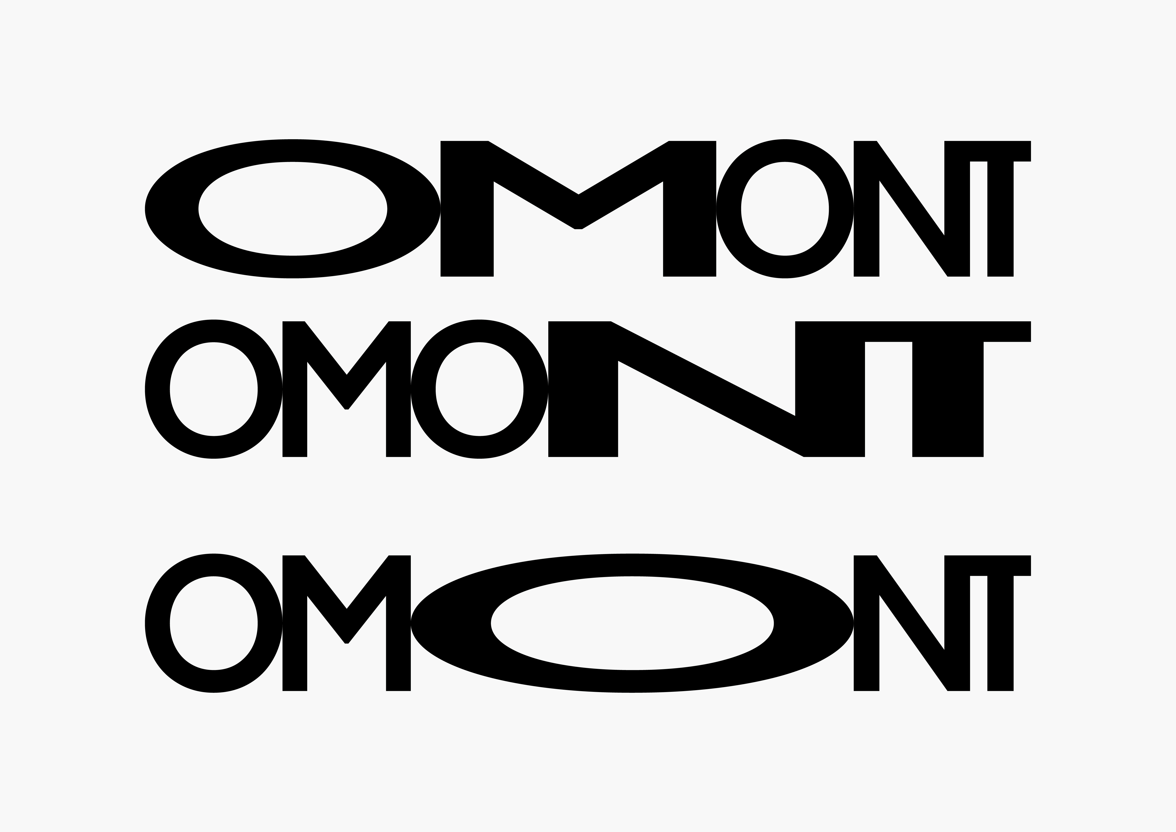
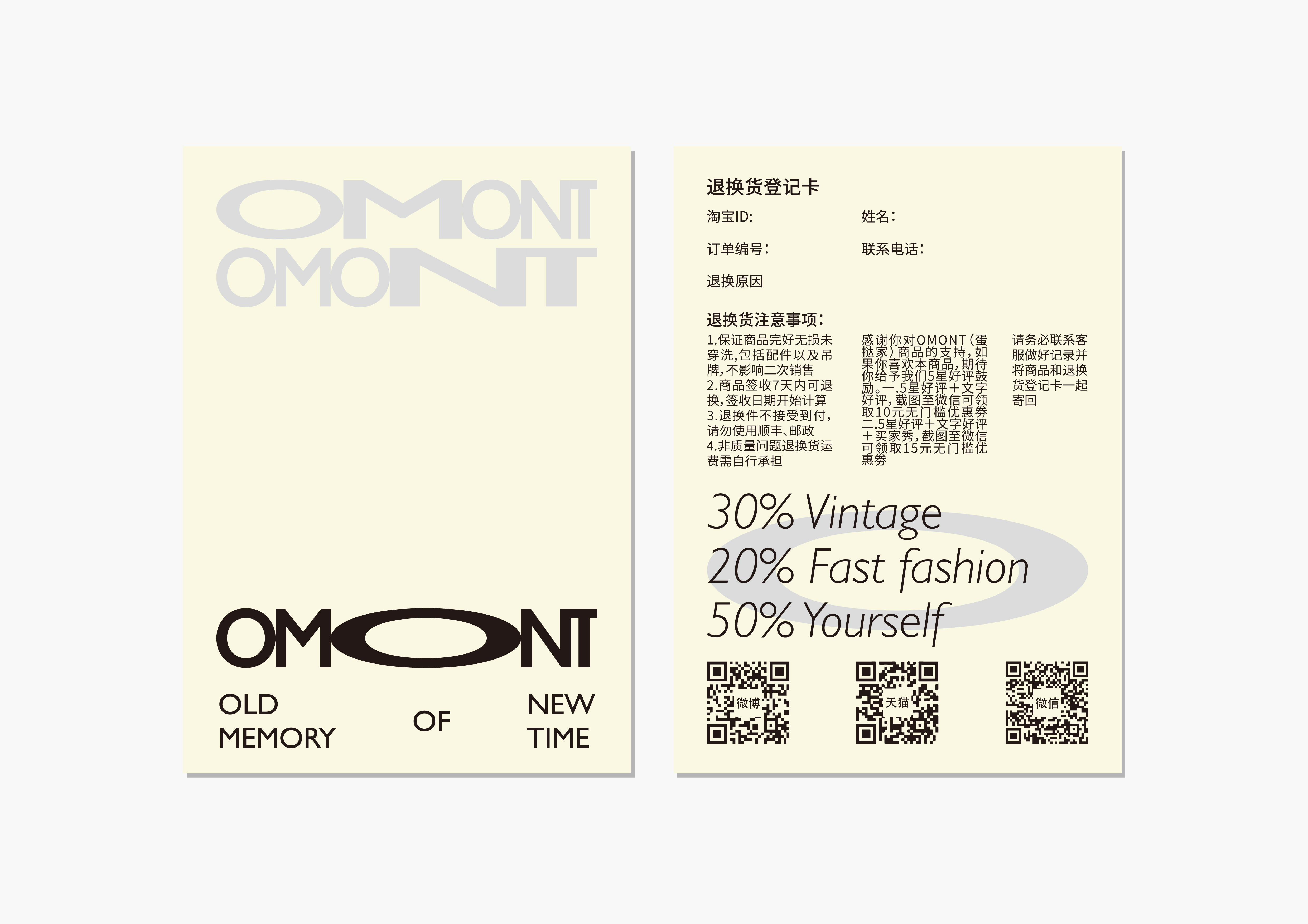
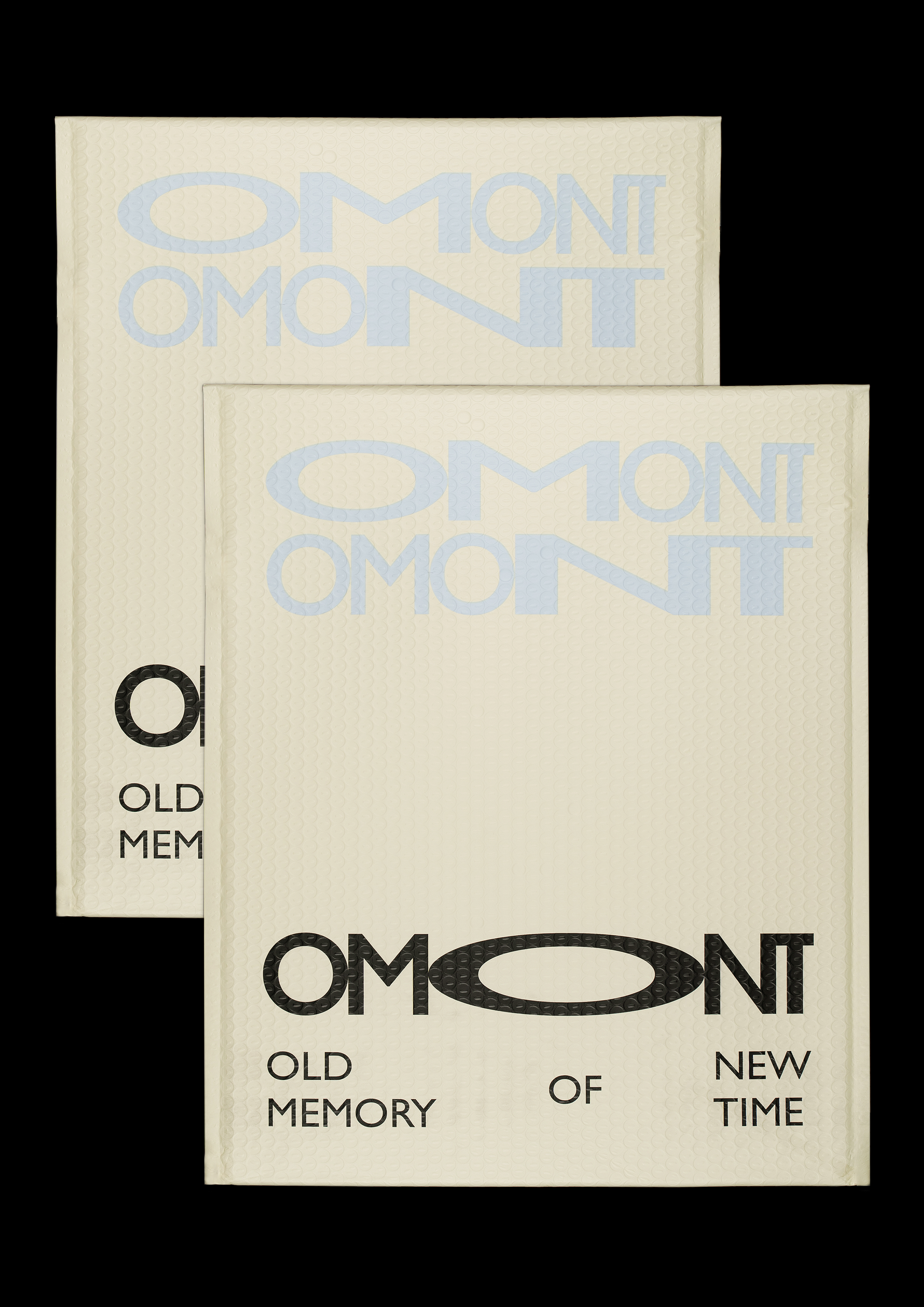
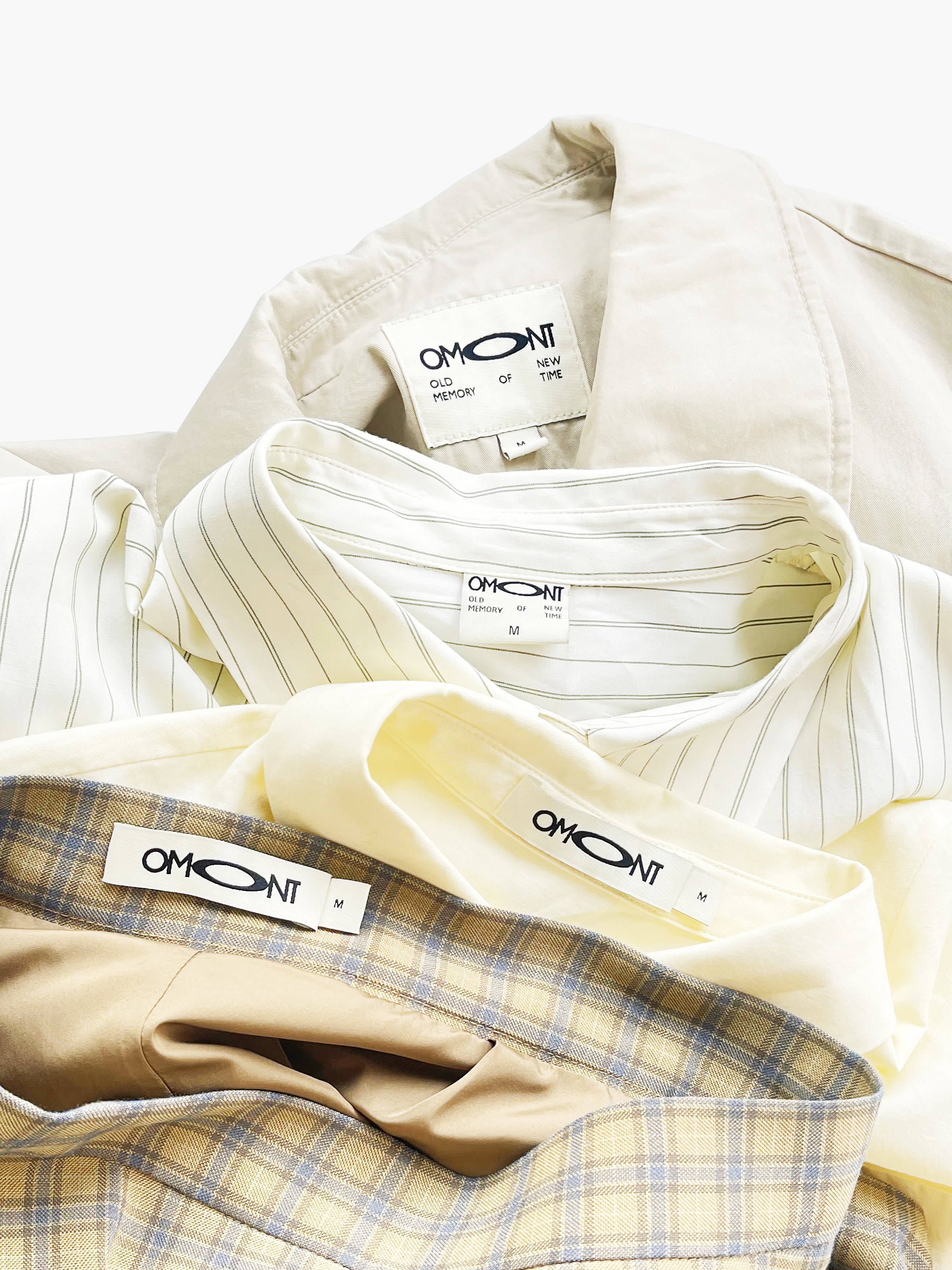
30% vintage and 20% fast fashion constitute the concept of light retro. The remaining 50% belongs to each cool self. By stretching the middle letter "O" of the brand, we present the new brand image in the most direct way, and strictly follow the proportional relationship and meaning represented by the initial letter of the brand. "O" connects left with right, and also represents the unique personality and charm of ego. The new OMONT is not only the acronym of the brand, but also an interesting graphic.
“30%的vintage,20%fast fashion构成的轻复古概念, 剩余的50%,它属于酷酷的自己。”通过对品牌中间字母“O”的设计拉伸,我们以最直接的方式呈现出品牌的新形象,并且严格按照品牌首字母所代表的比例关系和含义。“O”即是连接左右之间的关系,也是代表自我的独特个性和魅力。 全新的OMONT即是品牌的首字母缩写,也可以看作是一个有趣的图形。OLD MEMORY OF NEW TIME.
OMONT
ART DIRECTOR: Xiao Nan
DESIGNER: Kai Chang
MOTION DESIGNER:Huang Qian
CLIENT: Dan Ta Jia
YEAR: 2022