Shan Zhi Shen is a new brand based on its own traditional agricultural product enterprises, which operates and develops new channels for sales with the younger generation. Before its establishment, the older generation worked hard to produce excellent agricultural products, which were mainly sold to wholesalers and some merchants in a traditional way. Shan Zhi Shen just wants to find the unique value of its own brand, find a breakthrough with the new design language, and expand more market space, so as to better sustainable development.
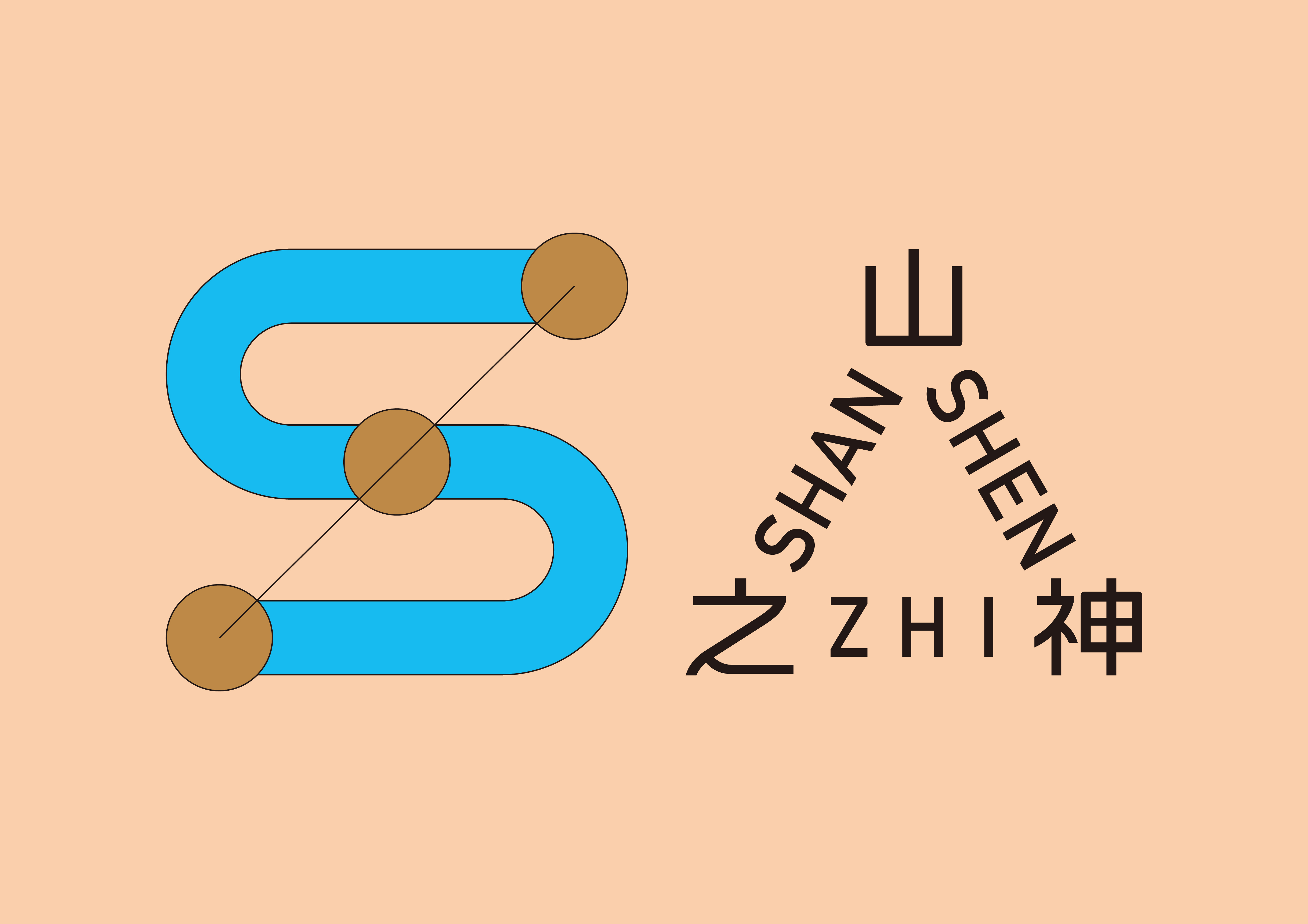
Therefore, in terms of design, we boldly use a younger and clearer visual language. Based on the initial letter "s" of Shan Zhi Shen and taking the inspiration of connection - "U" (Union) as the starting point. The circle and line represents the effective connection between agricultural products, brands and consumers. The color of the sky and earth is integrated into it as brand colors. The text part break the mold of the traditional typesetting, so as to better strengthen the concept of "connection". We hope that the presentation of the new brand image can be preferred and recognized by more and more young consumer markets.
山之神,是一家建立在自身传统农产品企业之上,以年轻一代运营和拓展新渠道销售的新品牌。在成立之前,老一辈人辛勤耕耘出优良的农产品,主要以原始的方式销售给批发商和部分商户。山之神正是希望找到自身品牌的独特价值,并以新的设计语言找到突破口,拓展更多市场空间,以便更好的可持续发展下去。
因此在设计上,我们大胆的使用更年轻、清晰的视觉语言,通过以山之神首写字母“S”为基础,以连接“U”(union)的灵感出发点,圆与线条代表农产品、品牌、消费者三者之间的有效连接。天空与大地的品牌色融入其中,文字部分突破传统的排版方式,以便更好的强化图形“连接”的概念。 我们希望新品牌形象的呈现可以获得更多的年轻化消费市场的喜爱和认可。
Shan Zhi Shen
山之神
ART DIRECTOR: Xiao Nan
DESIGNER: Kai Chang
CLIENT: Shan Zhi Shen
YEAR: 2021