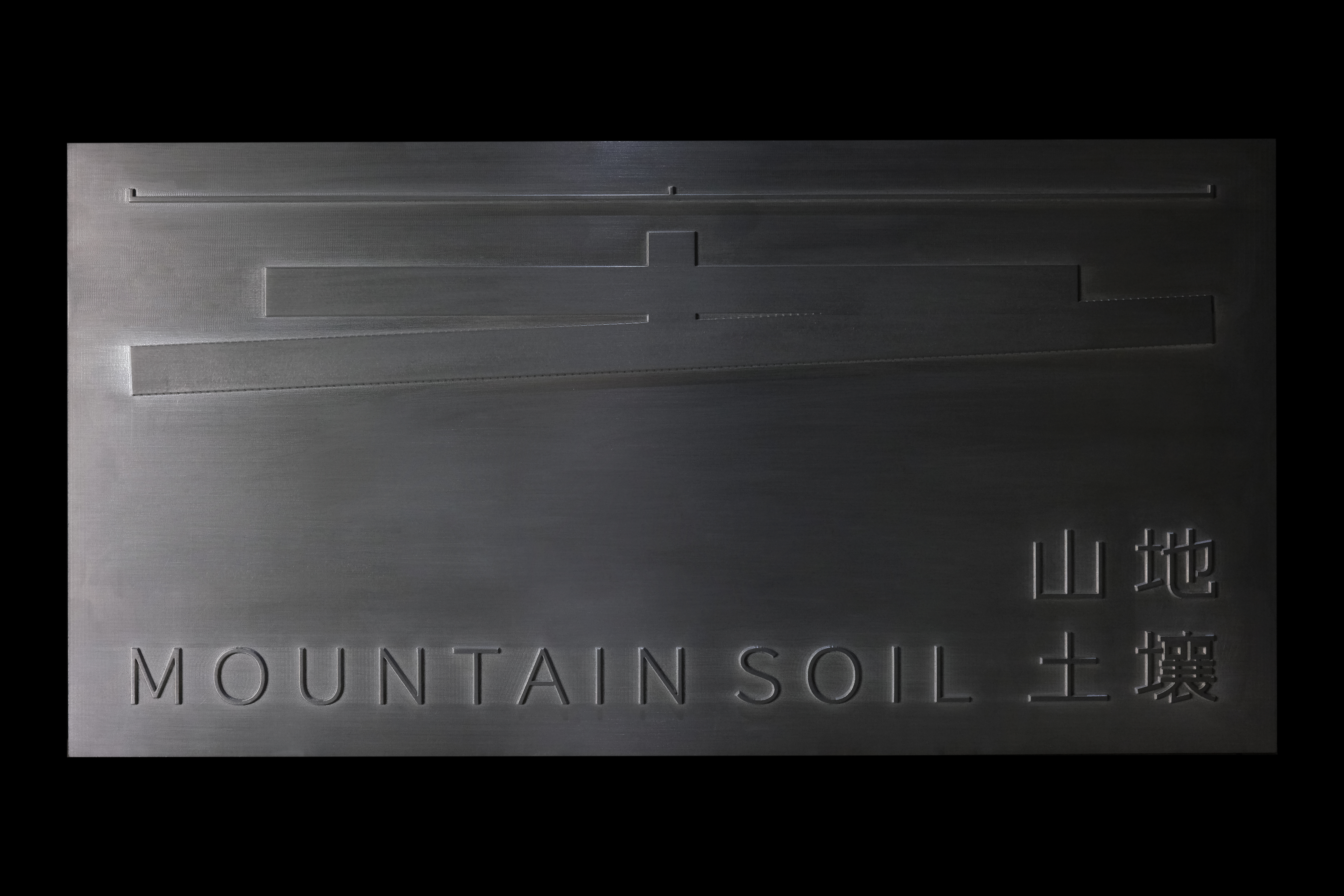
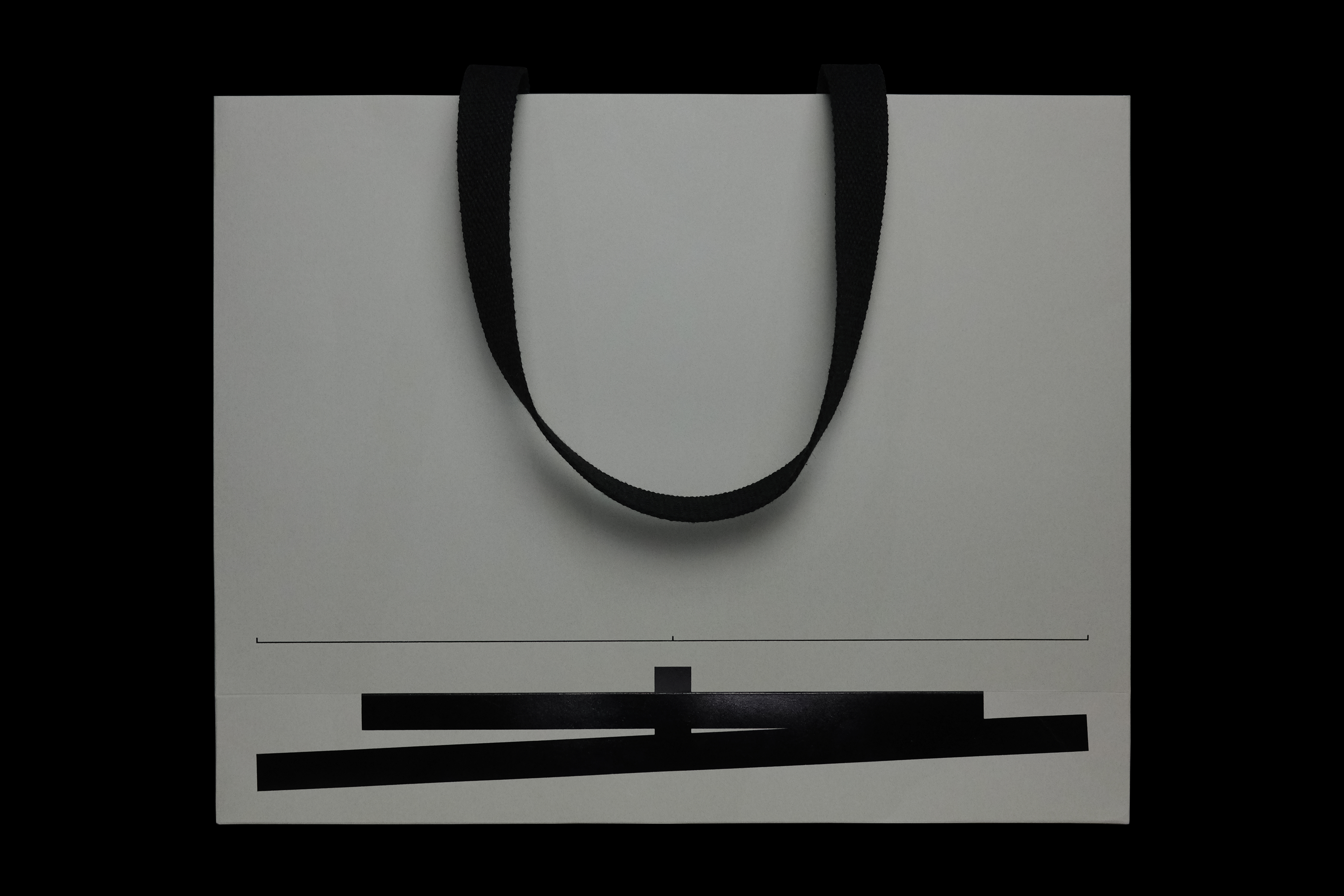
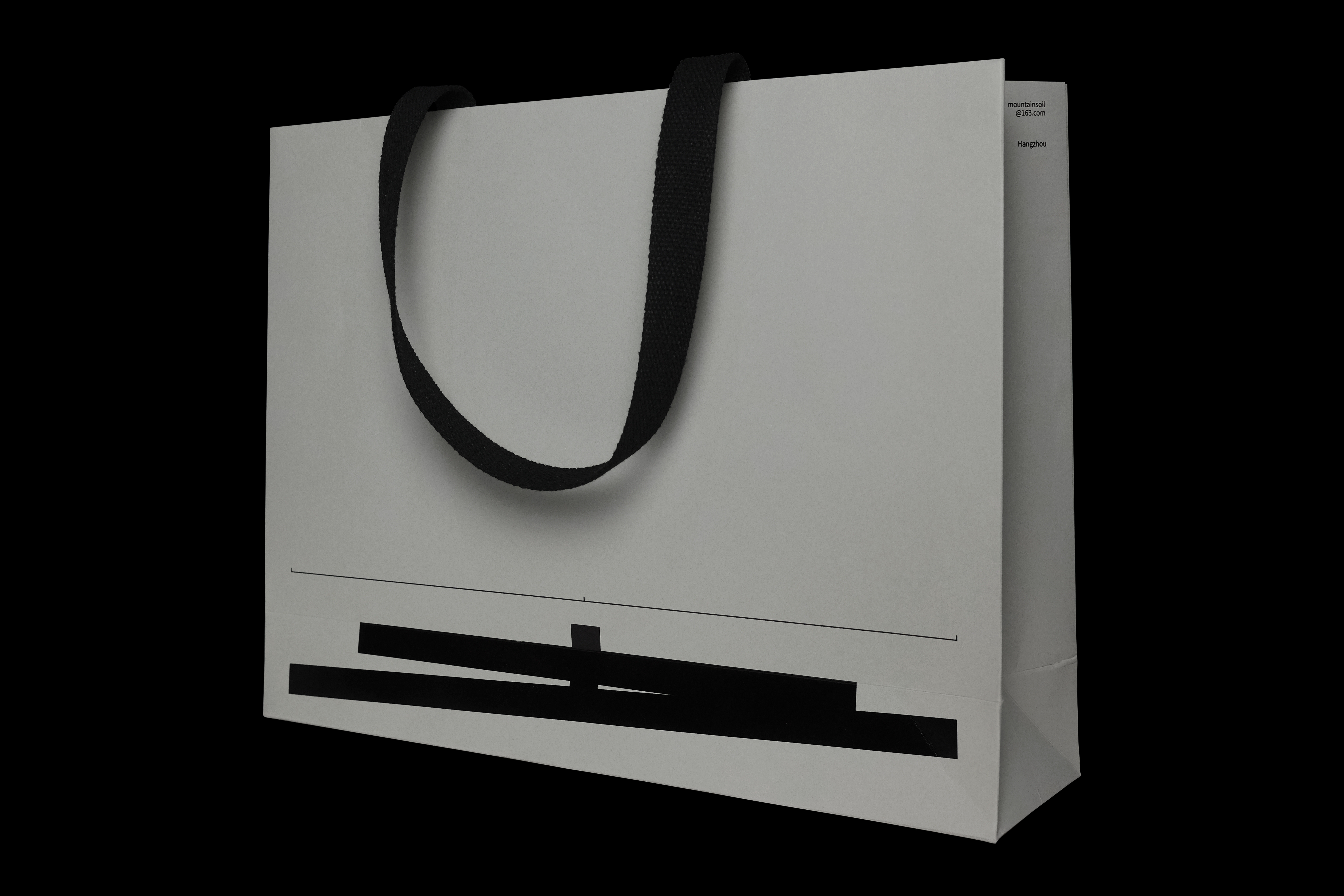
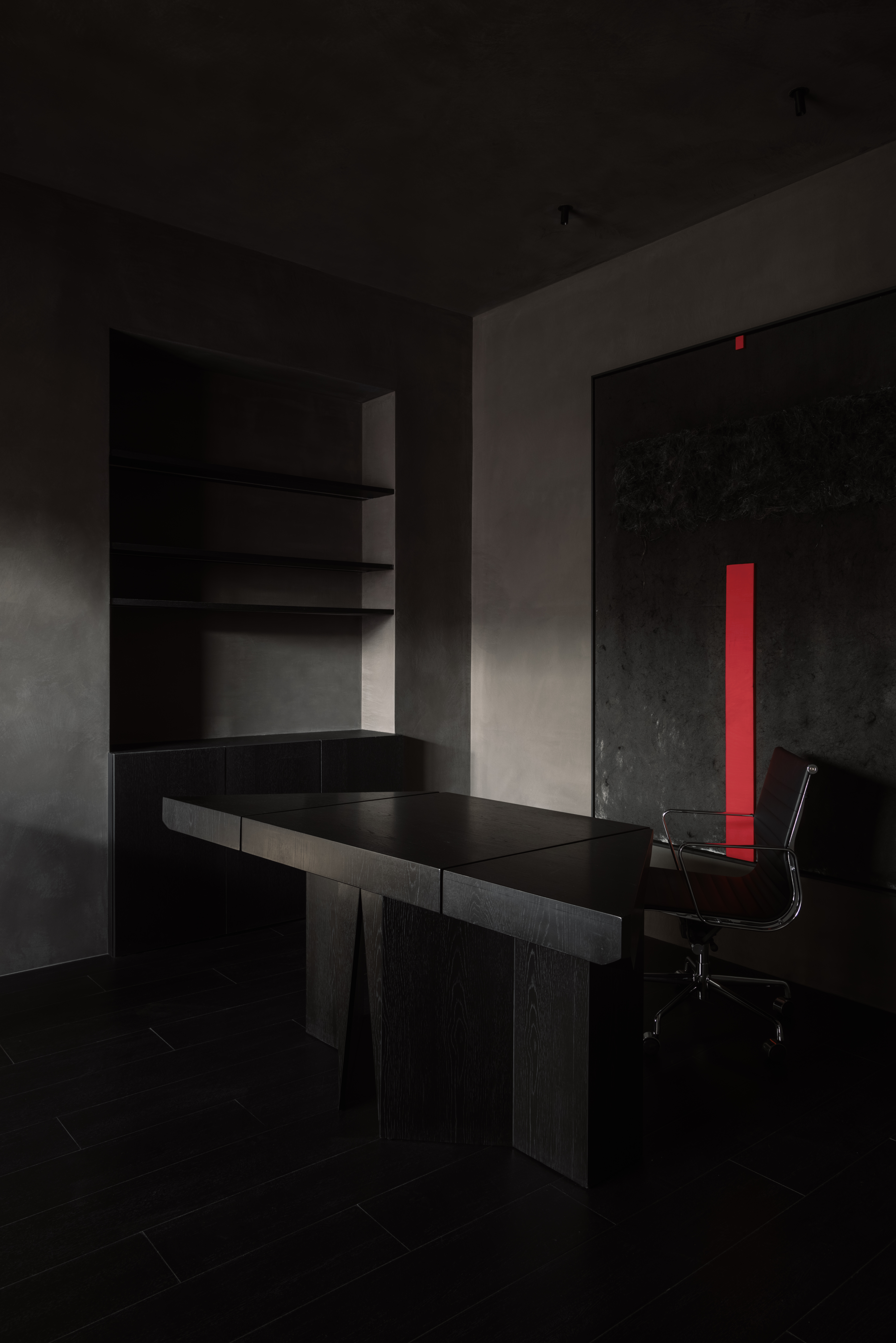
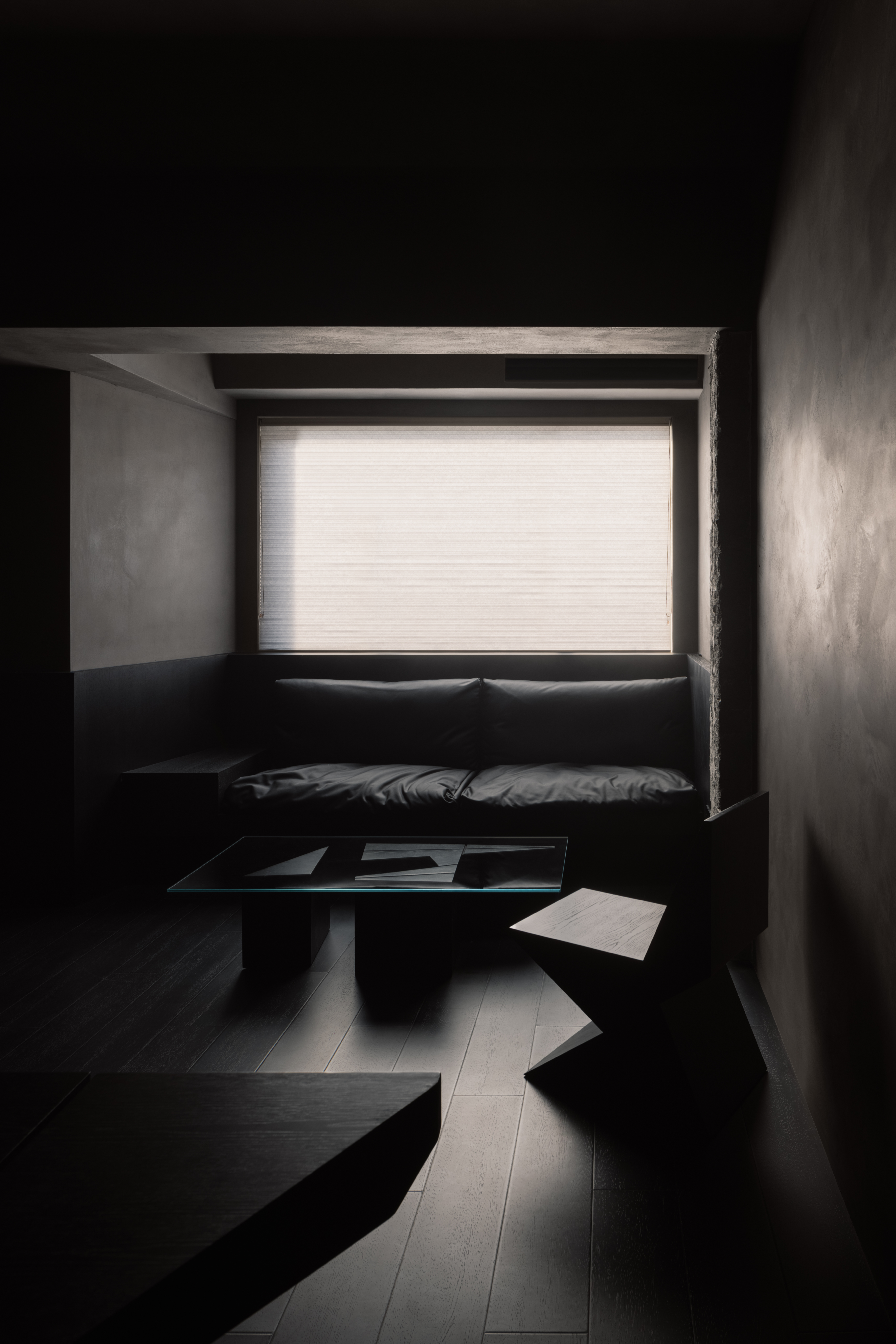
Mountain soil is a spatial design company located in Hangzhou. In the brand name, the Chinese characters “地、土、壤“ all contain the side of "soil(土)". Therefore, determined and elegant - the logo of Mountain Soil was designed with these keywords.
As a measure or reference object of the earth, we regard mountains as yardsticks, which are rational expressions. In architectural space design, functions, layout, structure and construction need to be dealt with strictly and rationally.The soil and the earth are regarded as sensual. They are the language of artistic design, the output of emotion and beauty. In logo design, the slight inclination angle is the perceptual and rational vision of balancing the whole. This is a way to break the conventional design and a good yearning for mountain soil.
As a measure or reference object of the earth, we regard mountains as yardsticks, which are rational expressions. In architectural space design, functions, layout, structure and construction need to be dealt with strictly and rationally.The soil and the earth are regarded as sensual. They are the language of artistic design, the output of emotion and beauty. In logo design, the slight inclination angle is the perceptual and rational vision of balancing the whole. This is a way to break the conventional design and a good yearning for mountain soil.
山地土壤是一家空间设计公司,坐落于杭州。品牌中,地、土、壤汉字均含有“土”偏旁。山地土壤的标识就是基于“山”与“土”这两个的关键词设计而成。
山,视为大地的度量器,或是参照物,我们把山作为标尺,是理性的表达,在建筑空间设计里,功能、布局、结构、建造等都需要严格理性的处理。
土,土壤、大地。视为感性的,是艺术设计语言、是情绪和美的输出。在标志设计中,微小的倾斜角度,是平衡整体的感性与理性视觉基调,是打破常规设计的思路、也是山地土壤对未来的美好向往。
山,视为大地的度量器,或是参照物,我们把山作为标尺,是理性的表达,在建筑空间设计里,功能、布局、结构、建造等都需要严格理性的处理。
土,土壤、大地。视为感性的,是艺术设计语言、是情绪和美的输出。在标志设计中,微小的倾斜角度,是平衡整体的感性与理性视觉基调,是打破常规设计的思路、也是山地土壤对未来的美好向往。
Mountain Soil
山地土壤
ART DIRECTOR: Xiao Nan
DESIGNER: Kai Chang
MOTION DESIGNER:Huang Qian
CLIENT: Mountain Soil
YEAR: 2021
